

Designed portal systems for bankers, brokers & customers to help improve overall usability
Client:
MY ROLE:
Senior UX Designer
WORKING WITH:
UI Designer, Business Analysts
SECTOR:
Banking/ Housing
Date:
Oct ‘21

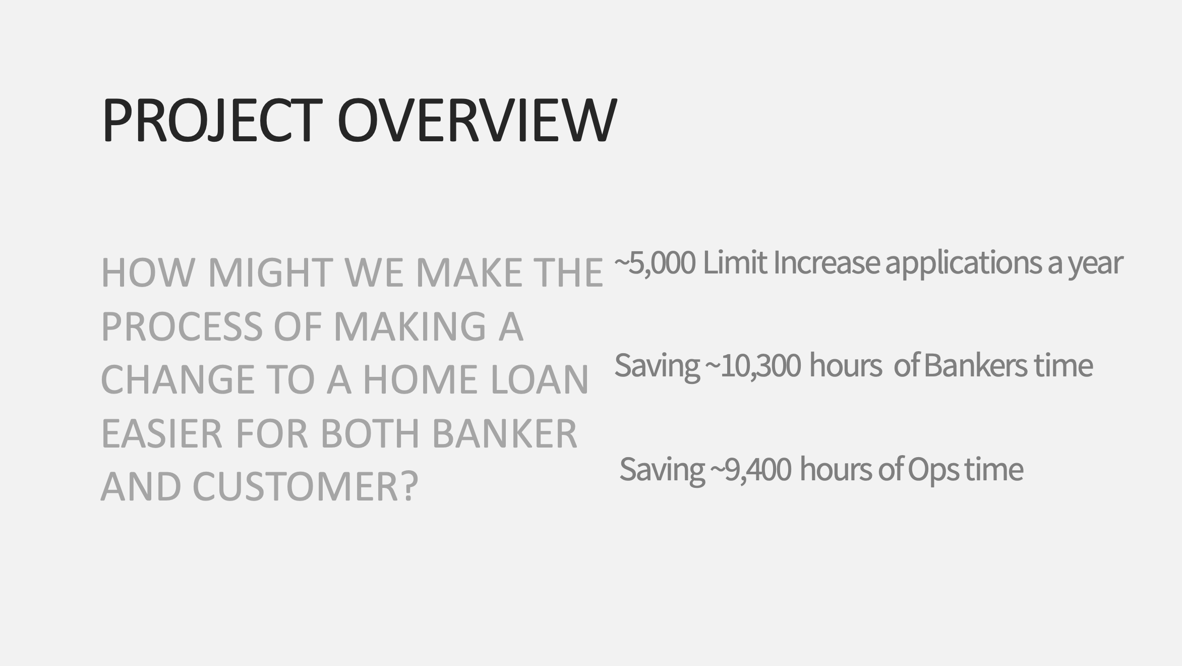
How might we make the process of home ownership easier for customer, banker and broker?
THE BRIEF
To review the current system to highlight issues and problems to design solutions to solve. Test and validate our approach and implement improvements before launch.

Synthesis after testing, showing problem area themes and below each theme, solutions/ opportunities to solve

A journey map I created showing the interactions with the service at key moments for proactive and reactive customers and a new and senior banker, to capture the full spectrum of the service
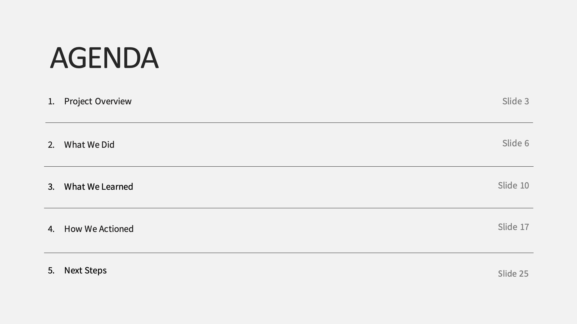
The Process
Stage 1: Discover
Kick Off Workshop
I began by delving deep into the project space and collating a list of questions after the initial briefing. I then created in the FigJam project space the schedule and our hoped outcomes of the workshop and the made the presentation to explain each activity.

For a workshop, I created a warm up activity called ‘10 alternative uses for a newspaper’ to get the participants used to creative, divergent thinking and the process of adding their ideas to the digital board and sharing them back to the group
Screen shot of our FigJam board and the introduction to the activities

‘10 alternative uses for a newspaper’ participants answers

An ideation activity where after problems had been identified, solutions were brainstormed, and red dots used as validation rounds from other participants in the workshop.
Stage 2: Define
Improved Screens UX Flow
As part of the discovery I had already mapped the current flow and highlighted areas for improvement that were the confirmed in testing later. I then made the changes and made a new flow of the improved journey, show below.

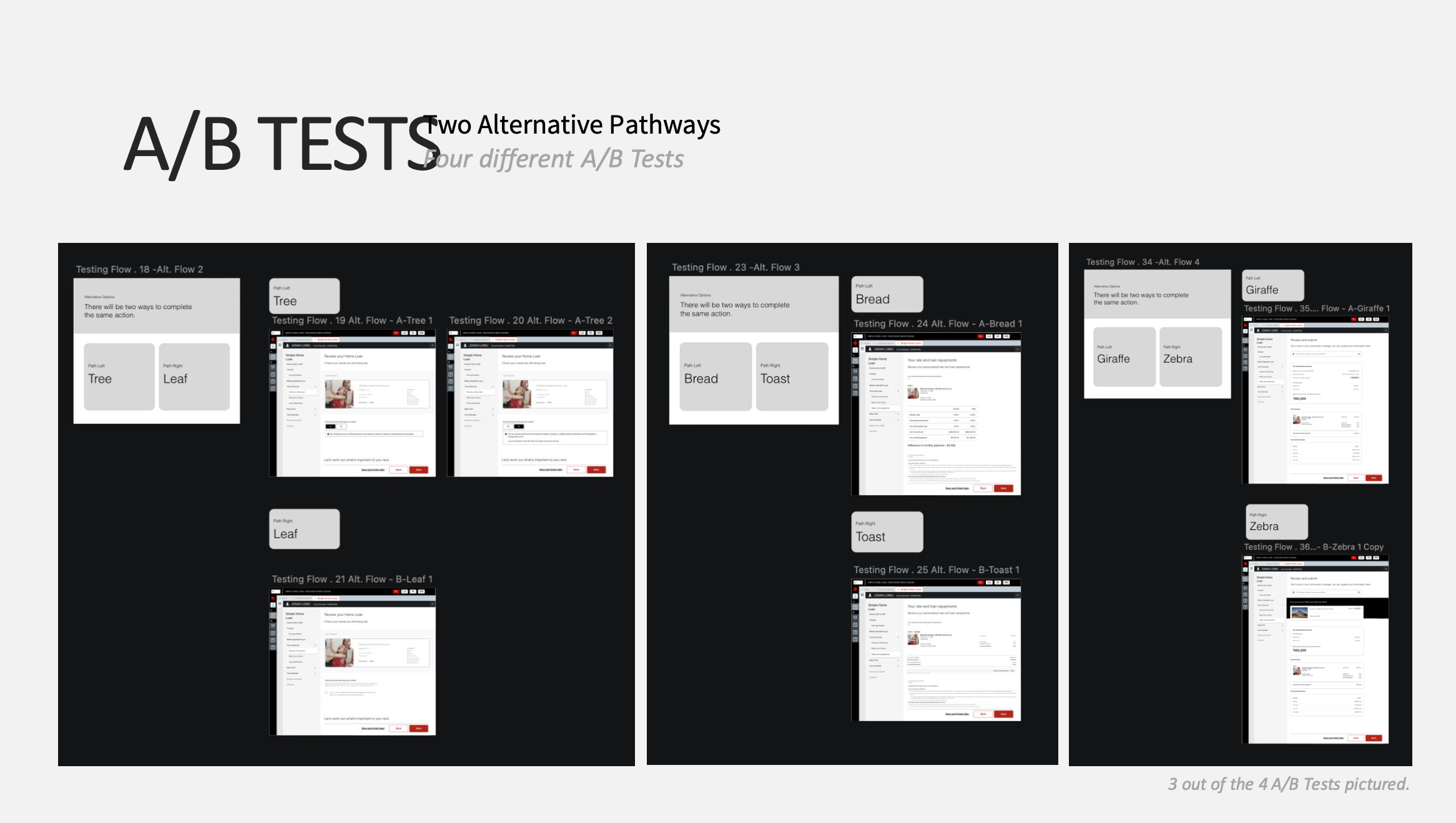
Variations to an existing home loan flow

User Flow
Early Designs
So we would have something to test with, I leveraged the design system and the existing shell of the service, which would not be changing, to quickly spin up designs into a clickable prototype.

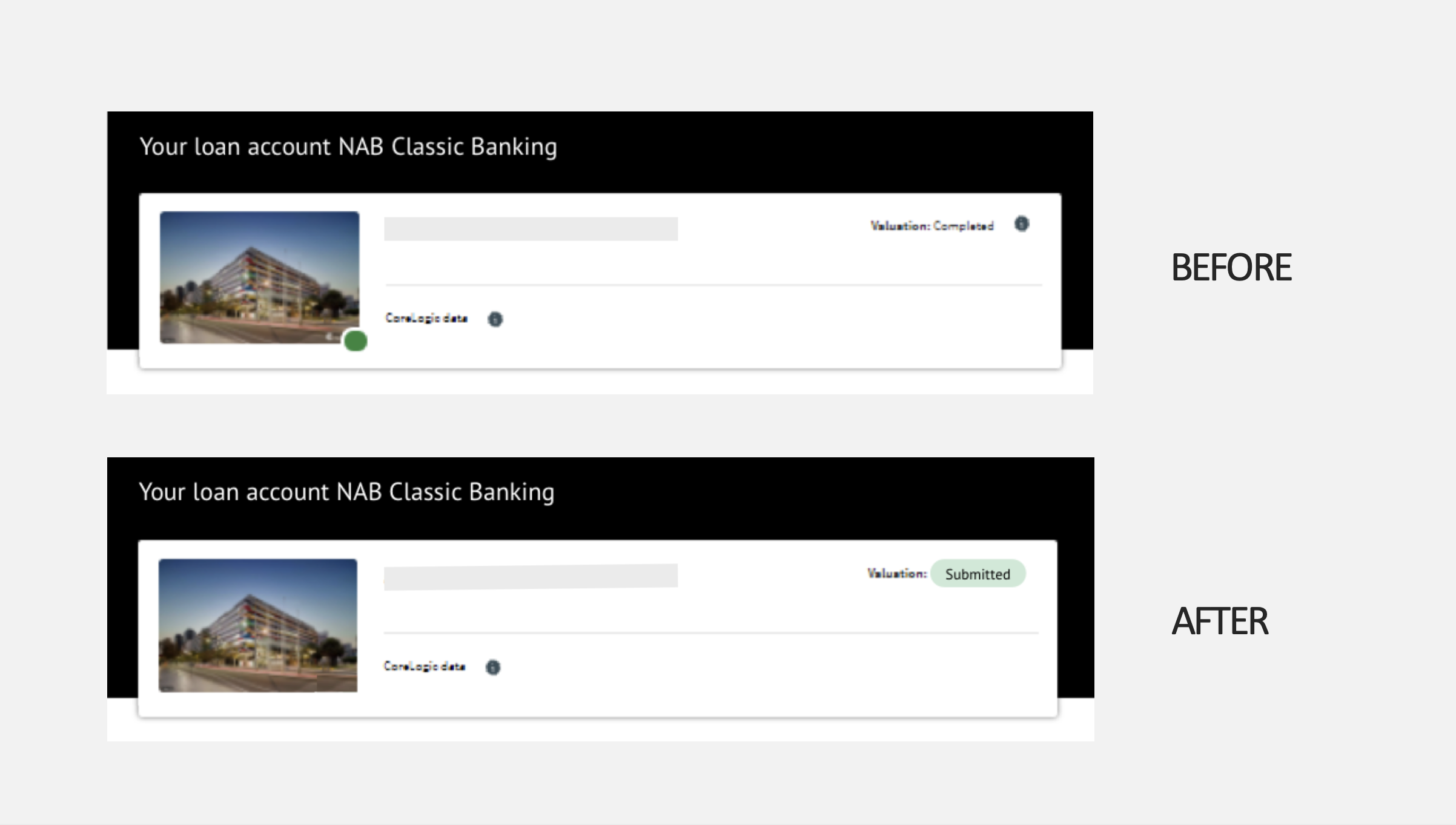
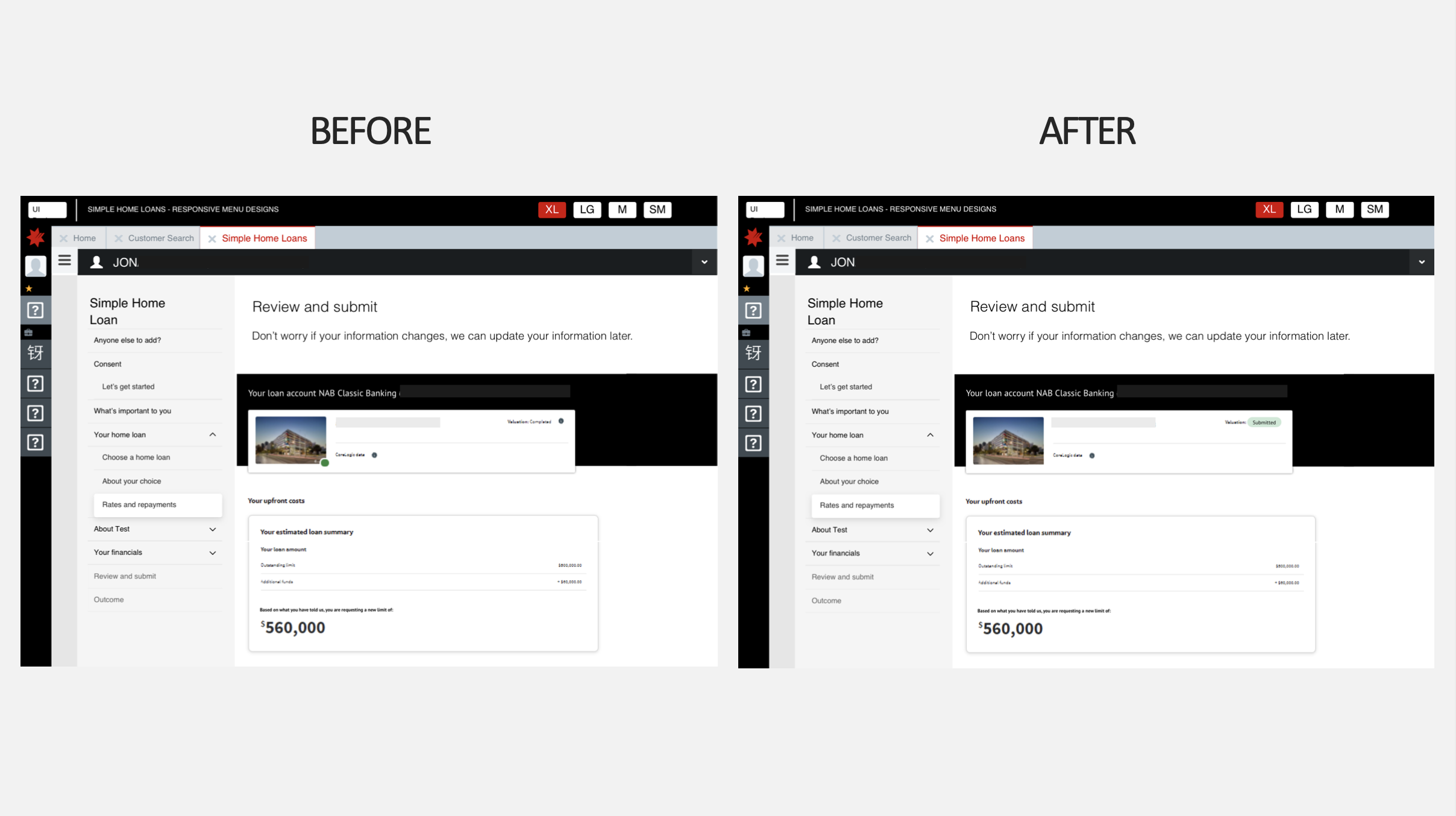
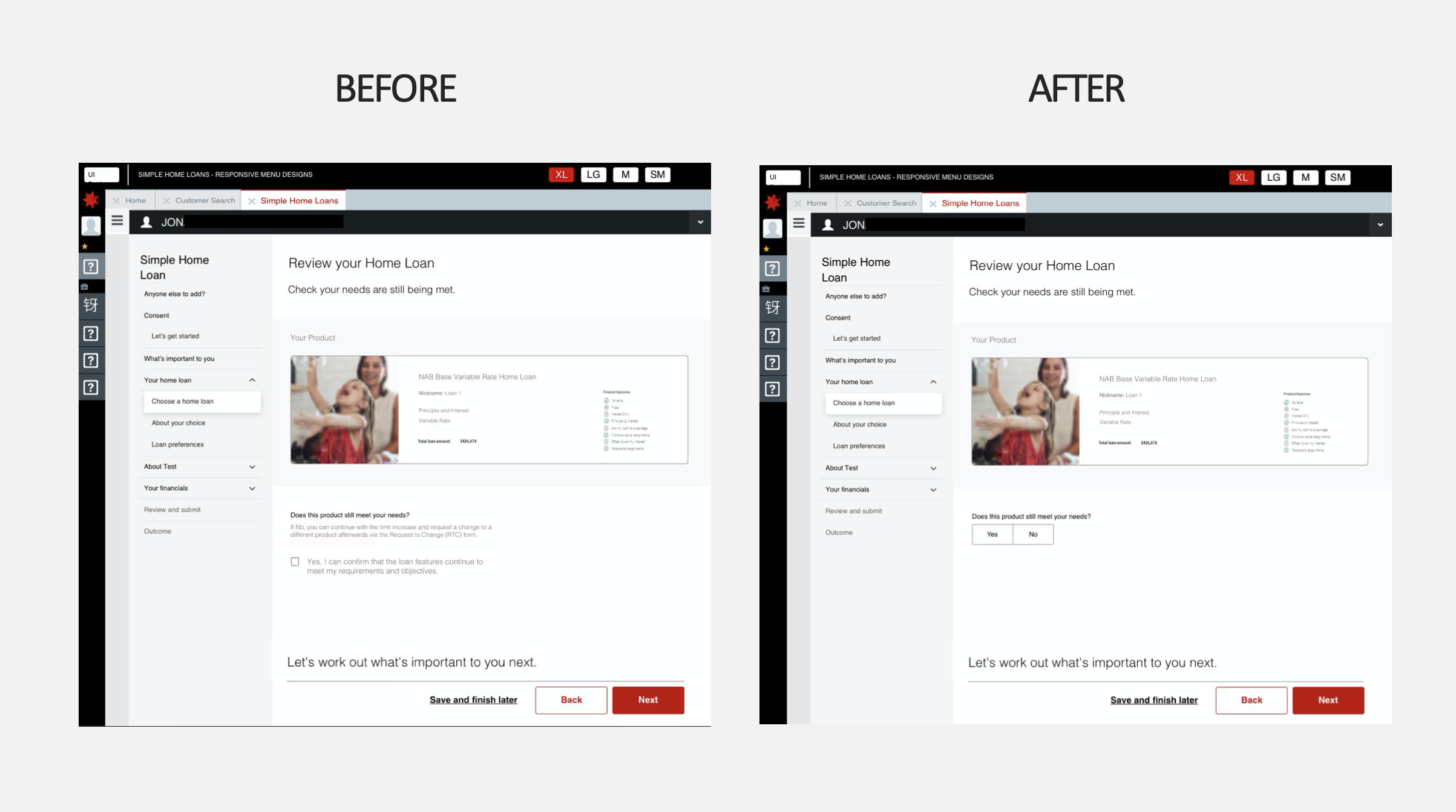
The loan review screen
Testing / Interview Sessions
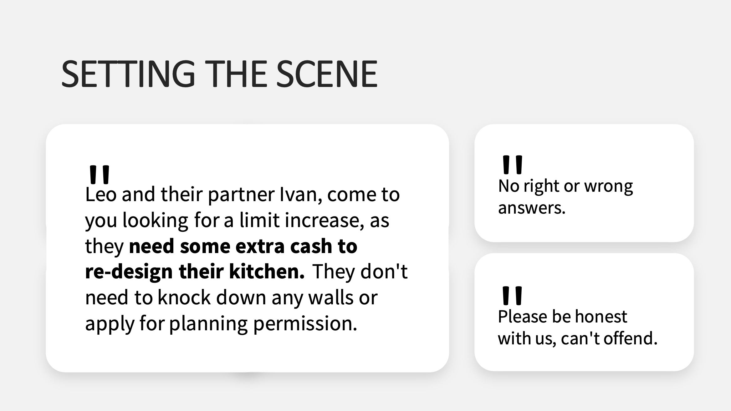
I created a space where project questions and hypothesis could be captured, as well as the script of questions I would ask the Customer, Banker or Broker participants. I also created a scenario to test our new designs on.

Testing planning

Working board/ project space
Synthesis
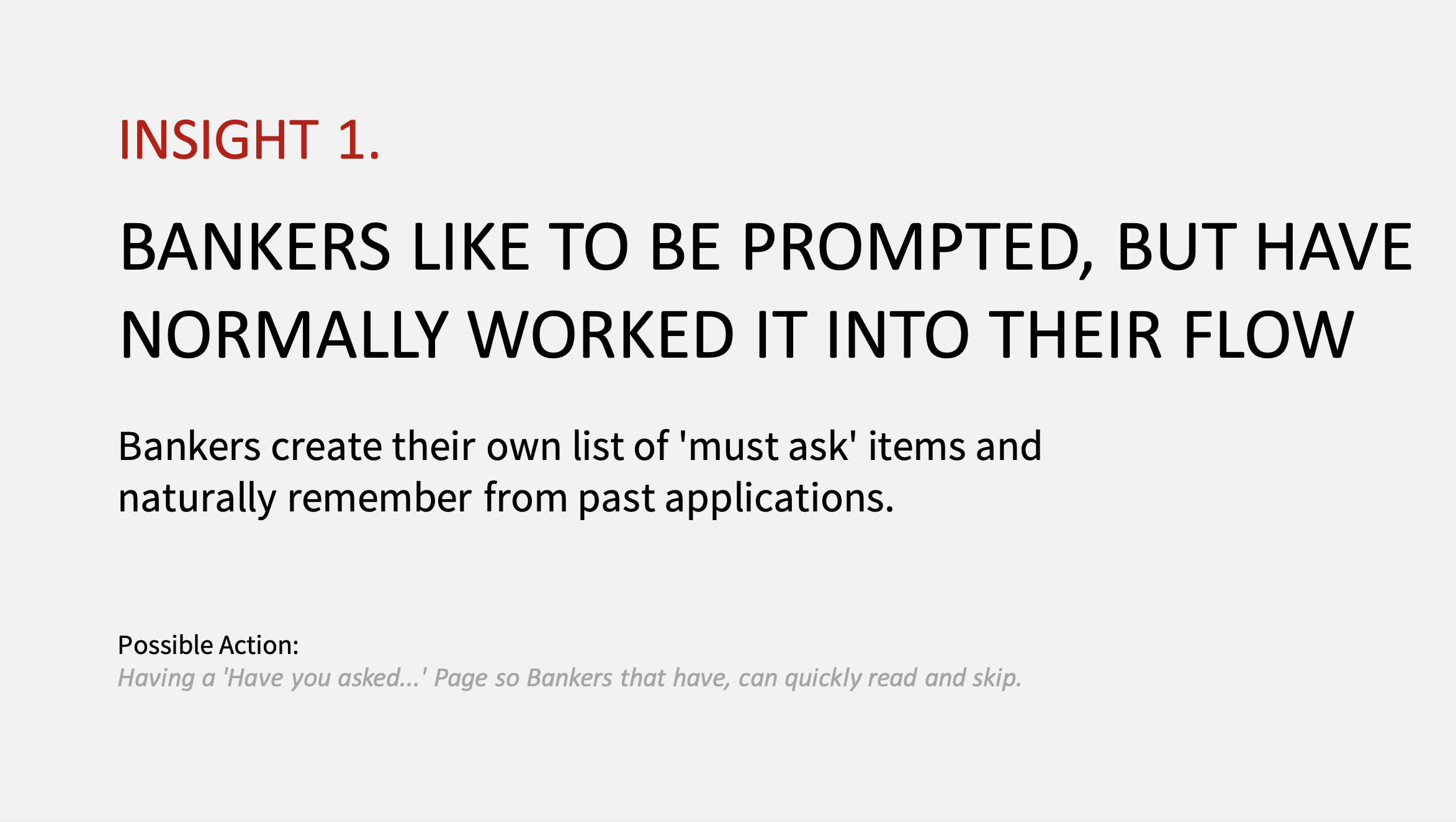
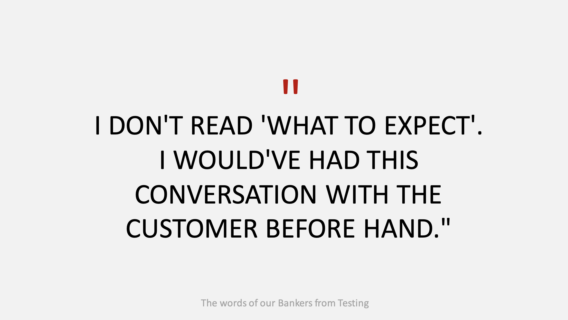
I began two rounds of synthesis to find the commonalities between the responses. For the design related feedback, I asked for it to be captured directly next to the designs of the screens in FigJam for context. Recommendations were also then made under each screen.

Synth-ing code system to show our focus

User Testing Synthesis

Flow improvements recommendations
Stage 3: Design
Visual Designs
From the feedback we received with the early visual design prototype, improvements were made and the designs were sent for final approval.

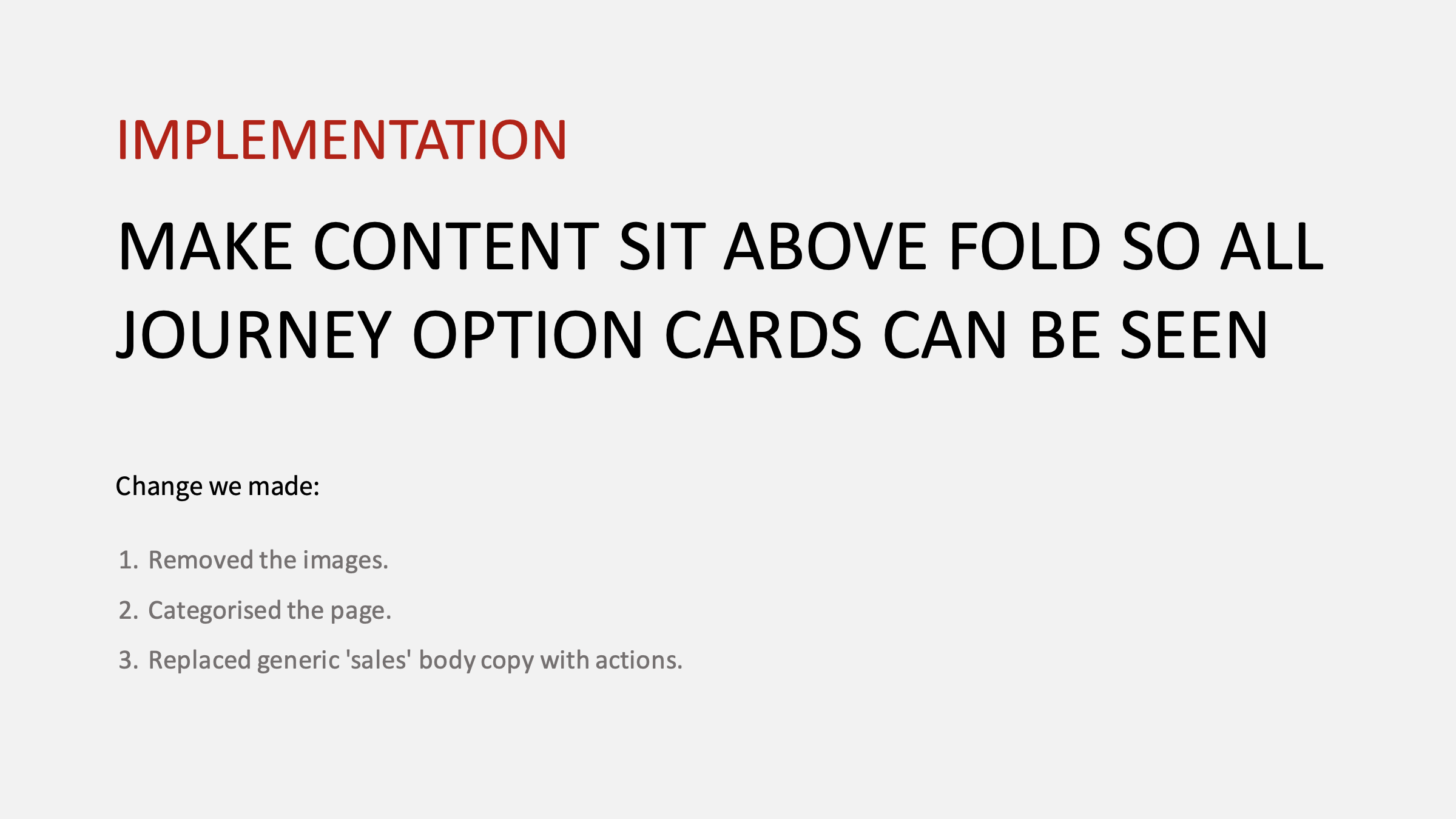
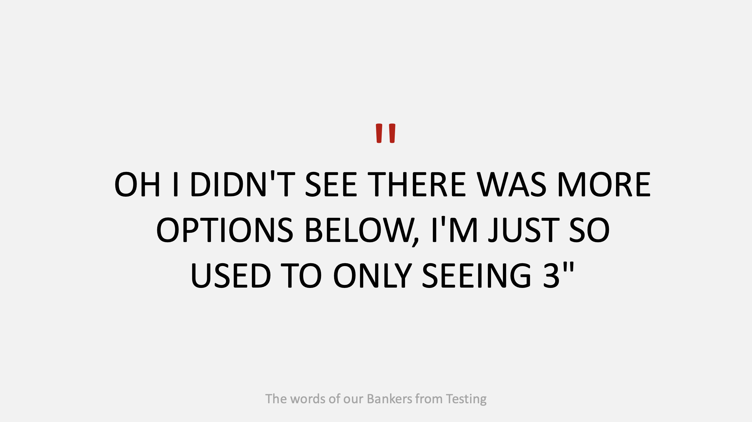
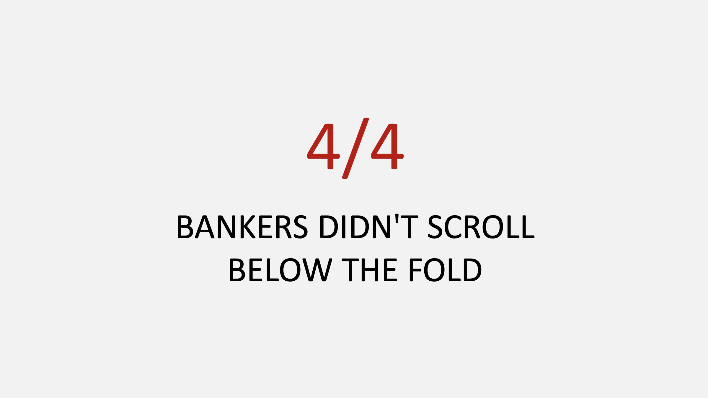
Re-design of the selection of a pathway to allow for all options to be seen on screen at once

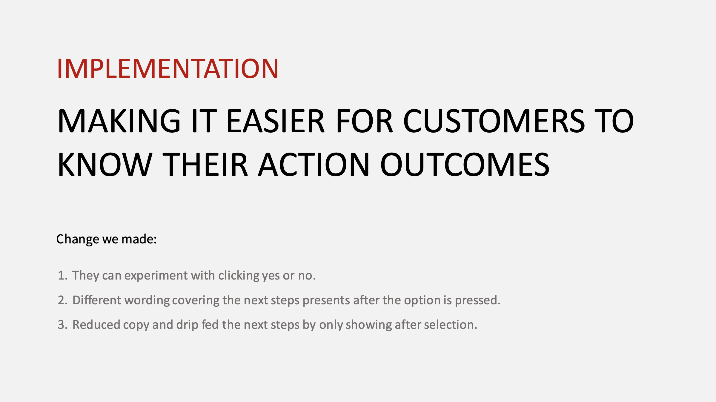
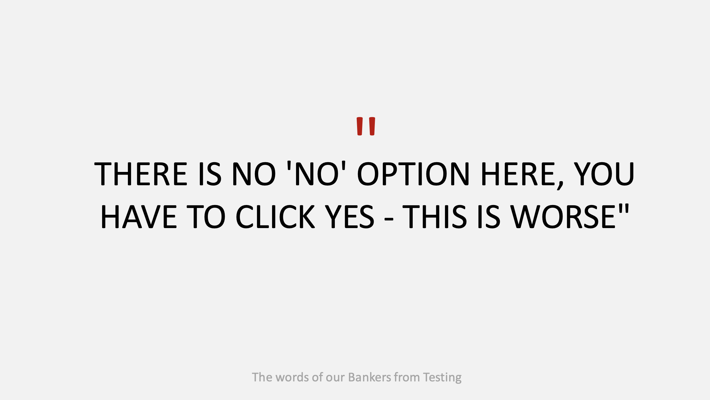
Co-Design Sessions for solutions for additional flows being added to the menu

User Flow
Stage 4: Delivery
Opportunity Mapping
I conducted an exploration of the solutions from the testing interviews to form an Opportunity Map, which categorises the options based on two ranking linear scales; vertical for ‘Impact & Value’ and horizontal for ‘Cost & Effort’.

Opportunity Map exploration based of testing interviews

Opportunity Map ranked on ‘Impact & Value’ and ‘Cost & Effort’
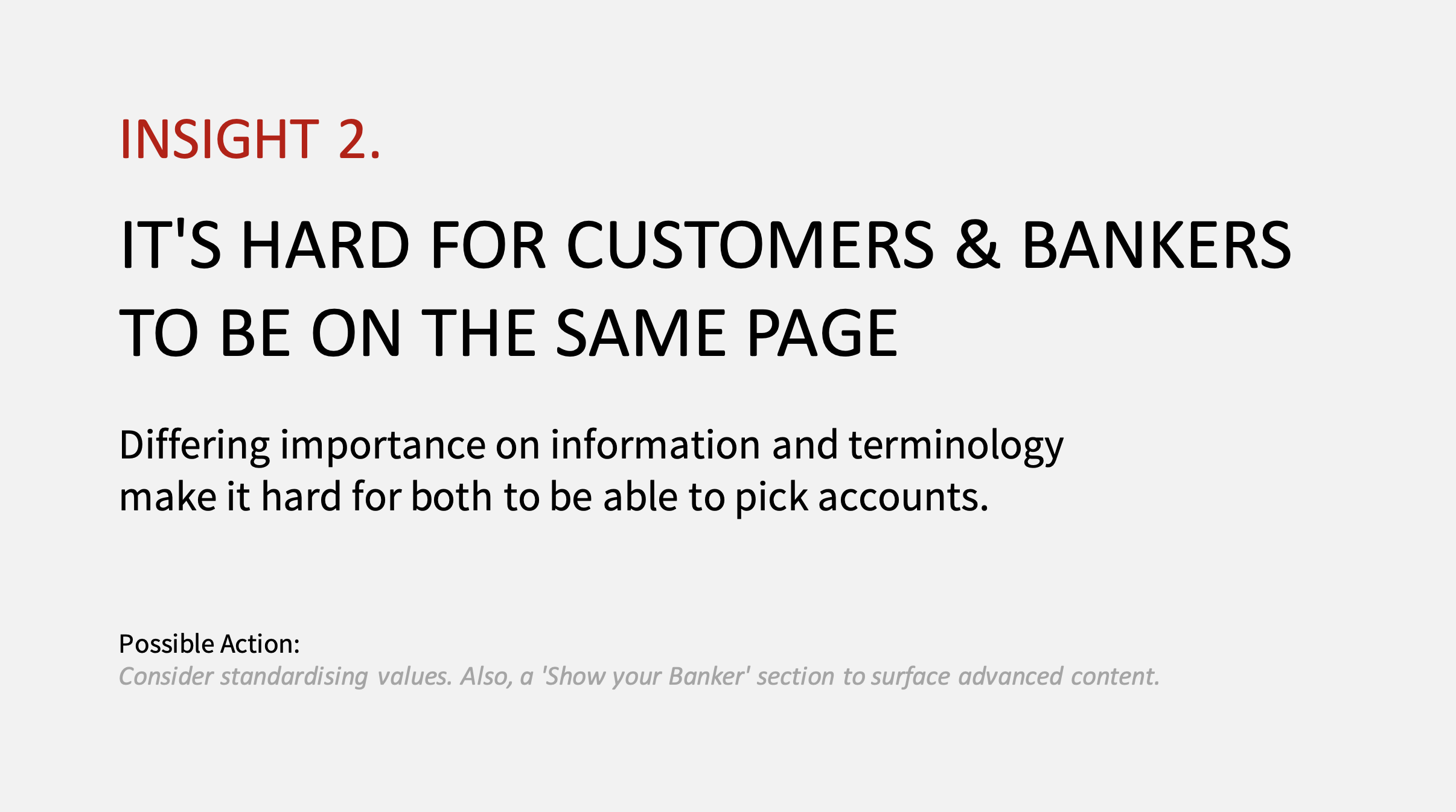
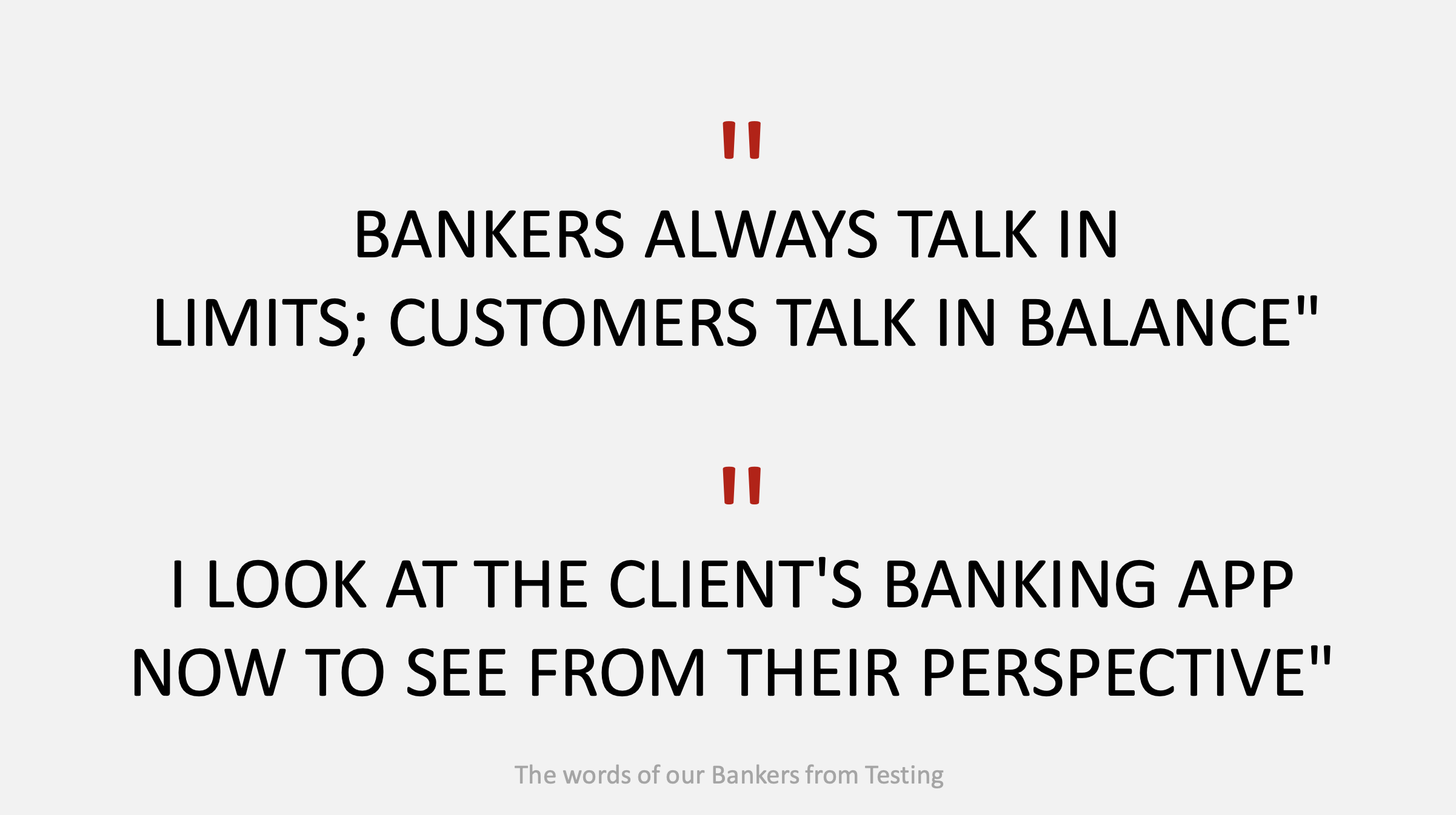
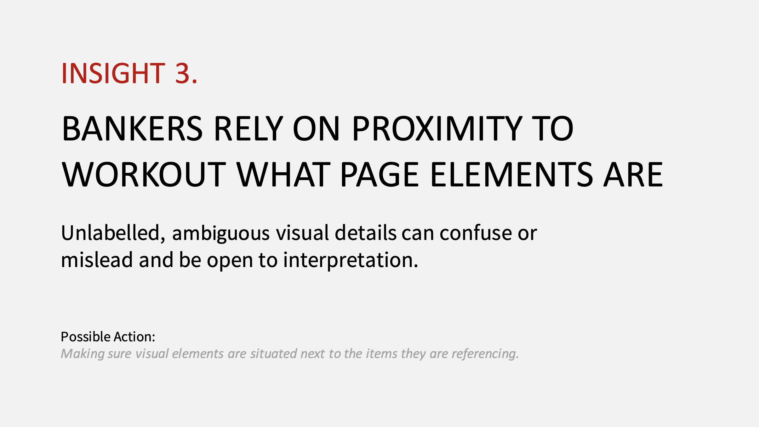
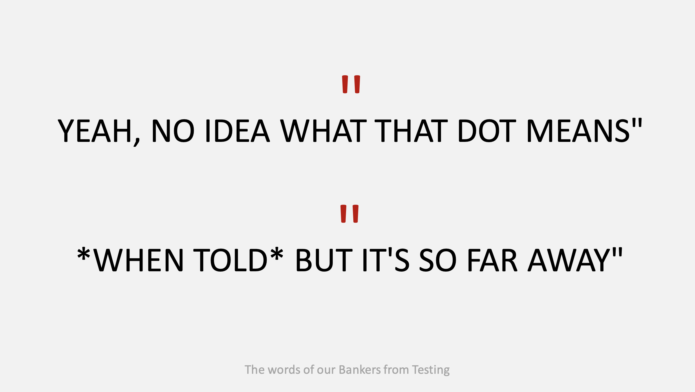
Insights Presentation
Created a presentation/ PDF of our projects insights, learnings & recommendations to explain our approach and share our outcomes with the wider team. This was also presented to stakeholders, product owners and developers at the final showcase.
Designed at Bound Studio

Re-design of the pathway selection beginning screen, with the introduction of category headers
