Designed a Mental Health App for Paramedics and Dispatch to help them access the right support they need
Client:
MY ROLE:
Senior Product (UX/UI) Designer and Project Manager
WORKING WITH:
Stakeholders, Mental Health Professionals, Public Relations & Developers.
SECTORs:
Healthcare, Government
Date:
Sep ‘23
How might we help Medical First Responders check in with themselves, remind they have multiple options of support, like in person sessions and written article information and the freedom of choice to connect?
OVERVIEW
To investigate and gain knowledge into the world of Paramedics & Dispatch and explore how an application made specifically for those who do the job can benefit wellbeing and mental health.
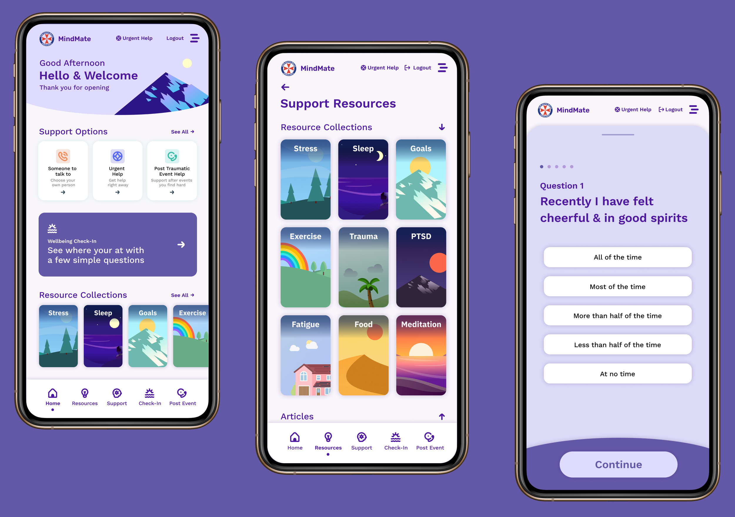
Left: Dashboard Middle: Support Hub Categories Right: Wellbeing Check-In
“Paramedics are 4 times more likely to experience a psychological traumatic event at work than any average job”
A statistic that highlights the need for a wellbeing app, co-designed with those who are in the job every day.
Stage 1: Discover
Problem Definition
Kick-Off Workshop
We hosted a half day workshop to a room full of experts, who know the environment that the app will exist within. With a series of activities we were able to rapidly knowledge share and define the problems Paramedics, Dispatch and Call Takers experience as part of their job. We created many artefacts such as Journey Maps, Persona/ Archetypes and RACI frameworks.
Myself hosting our kick off workshop- Here we are communally creating the Paramedic’s Journey Map.
Persona canvas I created bespoke for this project to capture the job archetypes
Persona Canvas completed in our Kick-off Workshop.
The job roles/ people related to the app being defined and an already completed Opportunity Canvas taped to the wall
The initial briefing on display and an empty Journey Map canvas stuck to the wall
Explanation Slides
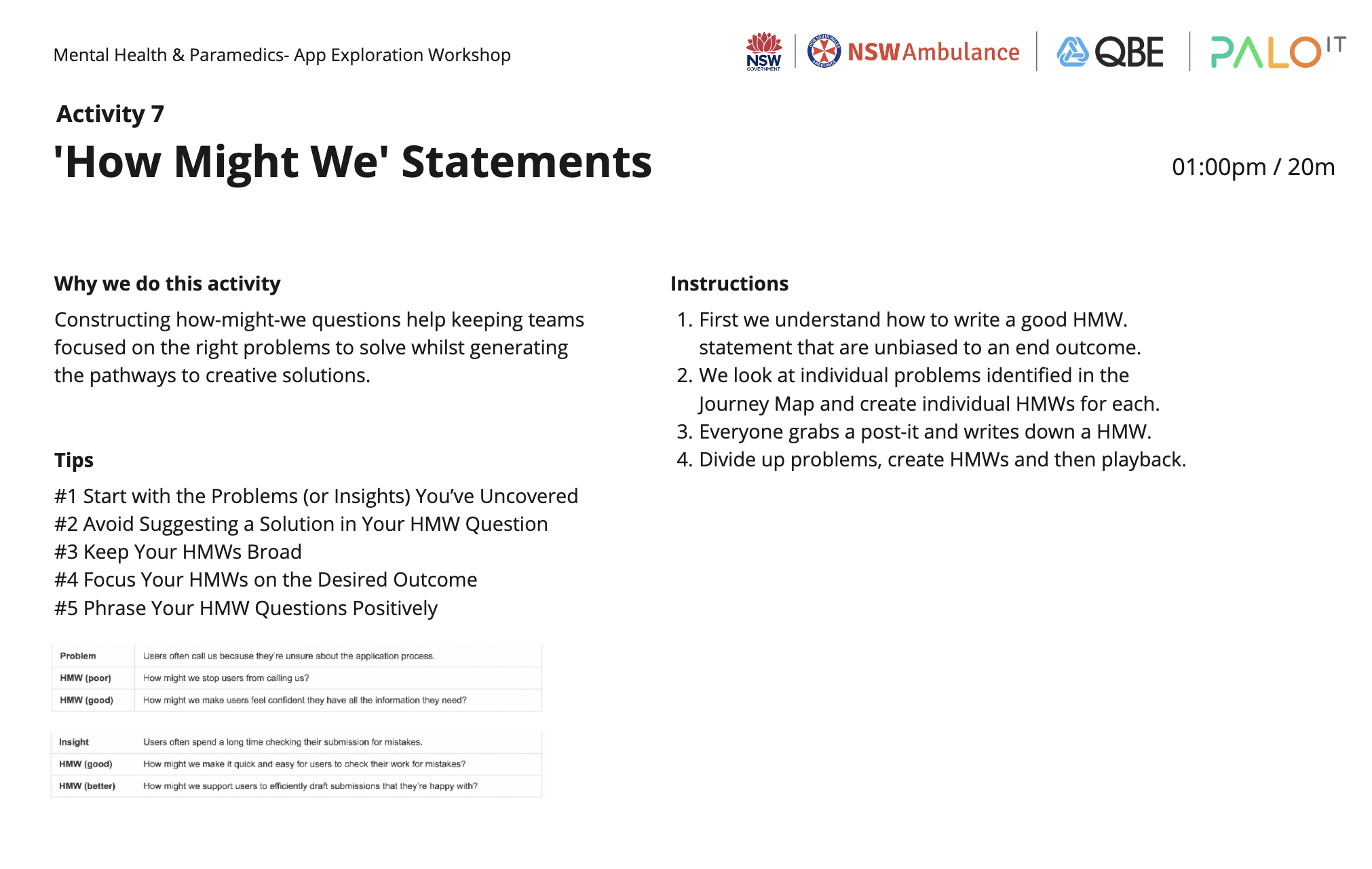
Within the in-person workshop we had a large screen displaying our slides, which I created for the workshop to introduce the project and each activity.
A few slides shown below:
Digitised version of the Paramedics Journey Map:
Stage 2: Define
Interviews, Co-Creation & Synthesis
Interview Sessions:
with Paramedics, Dispatch, Call Takers, Support Services, Family Representatives, Public Relations & Unions.
Next I created a revised list of questions for the different jobs roles which formed the base of the Interview Questions. The sessions ran for 1.5 hours, with the first 40-60 mins being for the conversational interview and the remaining part to the Co-Creation activities, the first was Sketches, where they’d draw or write what they want to see in the app, the second was a Card Sort, where they prioritised a series of 24 possible app features, made into cards.
My guidance on how to take good usable notes, saving time in the synth process.
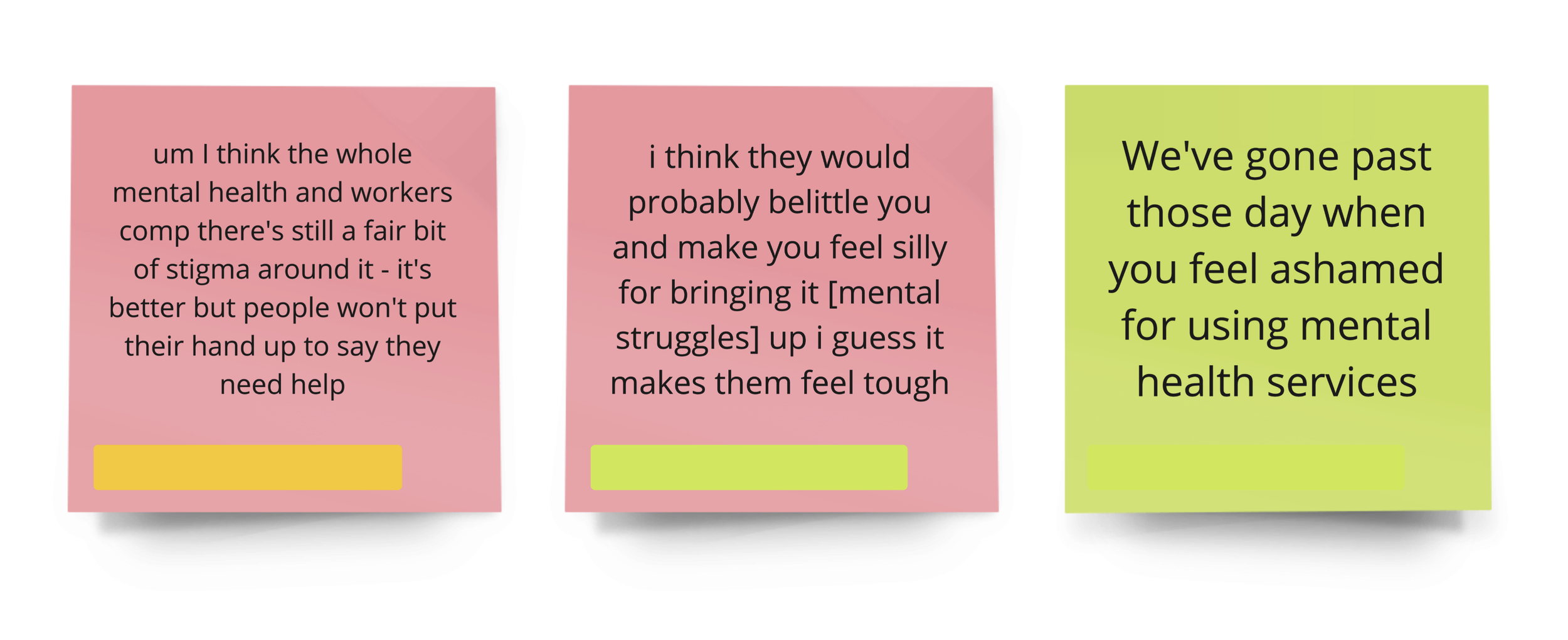
Some of the responses kindly shared with us:
Co-Creation Activity
I asked the participants to simply sketch what they’d like to see in a new metal health app created specifically for people just like them, who do their job. It was done as the first activity after the interviews, to get their unbiased opinions first before the card sort activity that introduced new ideas for features. I asked each participant whilst organising the sessions to ‘please have a bit of paper and a pen handy’ and set further context around each activity.
Co-creation Sketches from the testing sessions with Paramedics & Dispatch of what they’d want to see in an app.
Synthesis
I categorised the responses into 4 themes:
1. Negatives in Red 2. Positives in Green 3. App Ideas in Blue 4. Current Support in Purple
I conducted two rounds of synth to find the commonalities between the responses from our 14 Paramedic, Dispatch and Call Takers testers, which formed smaller themes within overarching areas. I kept all words on the post-its in the users original voice, omitting any personal details.
Negatives / Problems
Positives
App Ideas
Current Support
Testing synthesis in Miro - Finding the key themes/ similar ideas or problems from the 11 Paramedics & 4 Dispatch resposes to our 1.5 hour conversations/ context gathering and co-creation activities.
Card Rank
As the last activity in the test sessions, I asked each person ‘how important to you’ is this card, for 24 individual cards that were an idea for a possible feature for the app.
This allowed us to have a prioritised list of relevance from our direct user groups, which formed the basis of what the MVP or first launch of the app should be and the Features Road Map to capture and plan for future releases.
The card sort activity gave us an understanding (and prioritised list) of what features people would want to use
Stage 3: Design
Visual Communication
Translating the UX learnings into the UI design
I began by sketching out possible representations of the features commonly mentioned in the research stage to discuss their feasibility with the team and to form the designs. The ‘real problem and digital solution’ map created in the UX phase also inspired these sketches.
Many visual languages and styles were trialled and Trauma Informed design practises addressed, like the use of calming visual styles (curved corners, padding/ space etc) and colour palette (soft purples, no bright white or dark colours) to create a safe and healing digital environment.
Left: Rough sketch to communicate ideas for the onboarding dialogue Right: Finalised screen
Post check-in dialogue and recommendations based on their responses
Screen shot of my Figma file with important resources and initial sketches for inspiration
Screen shot of figma with colour and illustration exploration
Stage 4: Report
Insights & Recommendations
The Research Pack
I created a detailed presentation, covering the projects process, as well as Recommendations, Learnings, Outcomes and Future Scope.
See some highlights of the full deck below:
Stage 5: Launch
Finalisation & Handover
Project Handover
As the initial scope of the project had now finished, I handed over the designs to Development and Management teams. The project is still in development as well as undergoing further testing and co-creation design phases, working directly with all the groups involved.
I am so thankful to all the Paramedics, Dispatch, Call Takers and everyone we spoke to for all their help and insight into their very unique job roles. And grateful for being the designer on this important project; I hope it has a positive effect within the medical first responders community.
Project Feedback
“From the outset Nicole crafted a thoughtful approach, facilitated a very successful workshop and engaged in deep (and sometimes personal) research with paramedics and NSW Ambulance staff. The designs she created became the foundation for the development of the app, which has now been launched and is used daily by frontline workers in the field. The success of this project can be attributed to the dedication and attention Nicole invested in their work, and the careful consideration and empathy she showed with staff and stakeholders.”
An article in NSW Ambulance publication
Designed at Palo IT


