

Designed a Learning Platform for Athletes and Coaches to help improve Team Performance with the use of personalised feedback
Client:
MY ROLE:
Senior Product (UX/UI) Designer
WORKING WITH:
Stakeholders, Product Manager & Developers
SECTORs:
Sport/ Technology
Date:
Sep ‘19

How might we help Coaches & Support Teams help their Athletes to continually improve as players and grow in their field?
OVERVIEW
Research into how Players & Coaches currently learn & teach, exploring how a desktop and mobile video app could make the learning process easier, aiding in improving outcomes for teams.

Left: Desktop view of the onboarding personalisation Right: Mobile view of the login screen
Coaches already use video of past matches to create personalised learning content for their players but it’s a very long and time consuming process that takes up the coaches focus. It’s also hard to get acknowledgment of players viewing & interacting with the content as limited options to add their own feedback.

Stage 1: Discover
Problem Definition
Persona Creation
I explored out the different roles who will be using the platform and the varying levels & views they would have. We also planned who we would interview and test with for this project.

Persona of a Coach role

Persona of a HR/ Wellbeing Manager role

Persona of a New Athlete role

Persona of a Experienced Athlete role
The personas evolved into a ‘Jobs to be Done’ Framework:

Interview Preparation
Now the roles were defined, we agreed upon who to talk to and how many sessions to conduct. I created a testing script of questions we’d like answered to influence the designs.

The script created
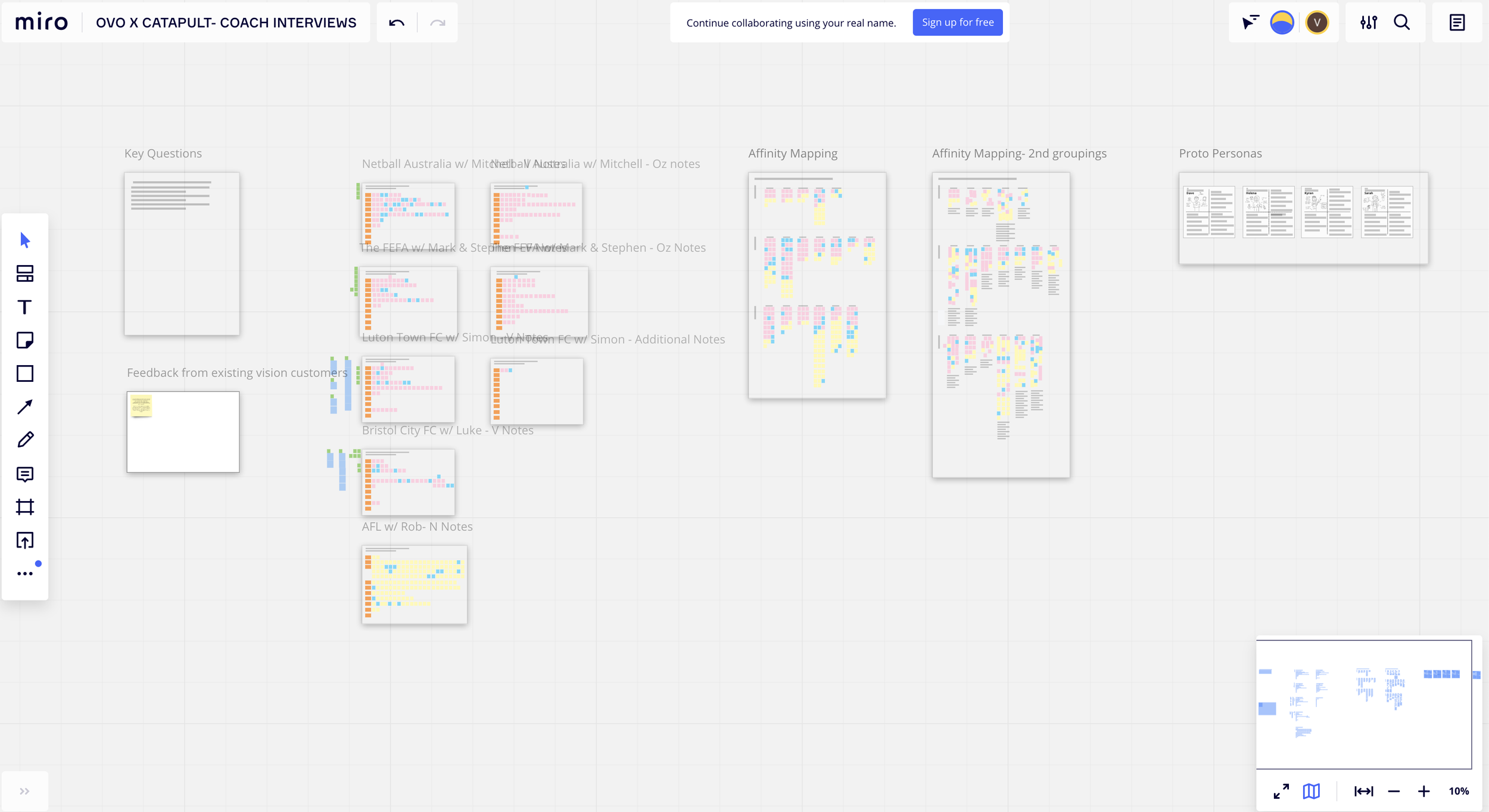
Miro space for interviews with the coaches

One interview response
Stage 2: Define
Interviews & Synthesis
Interview Sessions with Coaches & Performance Analysts
It was agreed that we would start with only the Coaches & Performance Analysts user group as they would be the primary users of the system, creating content for their players to learn. Of course getting the input of the Athletes who will consume the data on the other side was important, so testing sessions with athletes & others were set up for after the designs had been created.

The 5 coaches we interviewed for our sessions
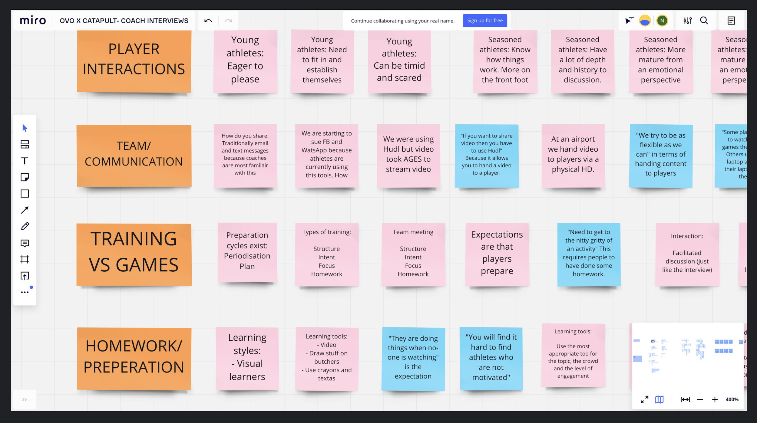
Some of the responses kindly shared with us
Synthesis
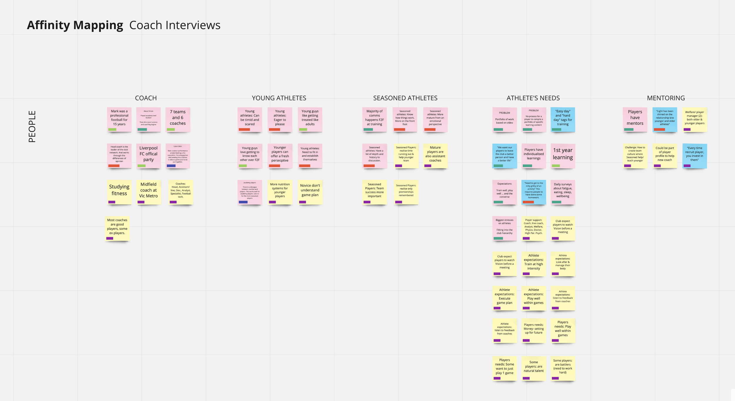
I conducted two rounds of synth to find the commonalities between the responses from our 5 Coaches & Performance Analysts, forming refined themes within overarching areas. I kept all words on the post-its in the users original voice.

From the 5 Coach Interviews, 384 insights were discovered and then synth-ed into key themes

Two rounds of synthesis
Affinity Mapping
I created an affinity map to further capture the connections between the responses, to see the frequency and size of problem & topic areas discovered in the research.


Stage 3: Design
Visual Communication
Translating the UX learnings into the UI design
I began by sketching out possible representations of key screens, mobile first, to discuss their feasibility with the team and to form the basis of the visual designs.

Quick sketches of the home, to-do & task detail pages and menu structure
Visual / User Interface Designs
I began by creating a very basic design system to allign styles for the next part, designing the pages. I used a ‘dark mode’ styling as the brand colour palette was black, orange and white, it’s also kinder on the eyes compared to a full white screen, great for reducing eye strain for players watching lots of video content.

Top: Notifications Middle: Settings Bottom: Edit Profile

Home screen on first lauch

A design of a collection with an alternative colour palette

Home screen- automatically opening the to-do items and showing progress

Collection screen- housing different tasks

Task screen- storing multiple videos with tags and the option to message about the topic with the team
User Flows
For both Desktop and Mobile I created full user flows that mapped all parts of the system for the Developers to build. I also considered how the portal would look based on if there was one video or 50 videos in 3 levels of multiple categories, to make sure the data always displayed in the most user friendly way possible.


Task Completion Flow

Onboarding Flow

Notifications Flow

Messaging Options Flow

Edit Profile & Settings
Stage 4: Deliver
Insights Deck & Design System
Research Learnings Pack
I created a presentation outlining the projects process, as well as recommendations and learnings. See some highlights of the full deck below:


Design System
I created my basic design system into an in-depth system to help the developers build the platform. Covering individual components, elements, patterns and styles.


Designed at Bound Studio (Formerly Our Very Own)


