

Designed a web chat service for National Relay Service to help Deaf, Hard of Hearing & Speech Impaired users to make a phone call
Client:

MY ROLE:
Senior UX/UI Designer
WORKING WITH:
UI Designer (sharing duties),
Stakeholders & POs.
SECTOR:
Government
Date:
May ‘22

How might we make it much easier for those with varying types of Hearing and Speech impairments to make a phone call using the National Relay Service?
OVERVIEW
The NRS is a very important service to bring independence to the Hearing or Speech impaired user, from ordering a pizza, to applying for a job, with the help of an Auslan Interpreter. Phone calls are an important aspect of life and everyone should be able to make them freely.

Web Chat / Messaging Screen in dark mode

An early, quick sketch of mine to show ideas for the web chat window

In the current system we noticed that users would accidentally hang up a call, so we designed this pop up prompt.
We purposely used a heavy visual approach, with lots of icons and diagrams, to make it easy to understand for the many people who are Deaf that use Auslan (Australian Sign Language) and don’t read English.
The Process
Phase 1: Discovery
Project Kick-Off
I began by creating a testing plan, to define objectives, the questions we would ask and a clickable prototype we would show and gather feedback on. I created a ‘call for testers’ explanation to post on the existing service to gather testing participants. We were able to organise 6 interview and test sessions.

My testing plan in Miro
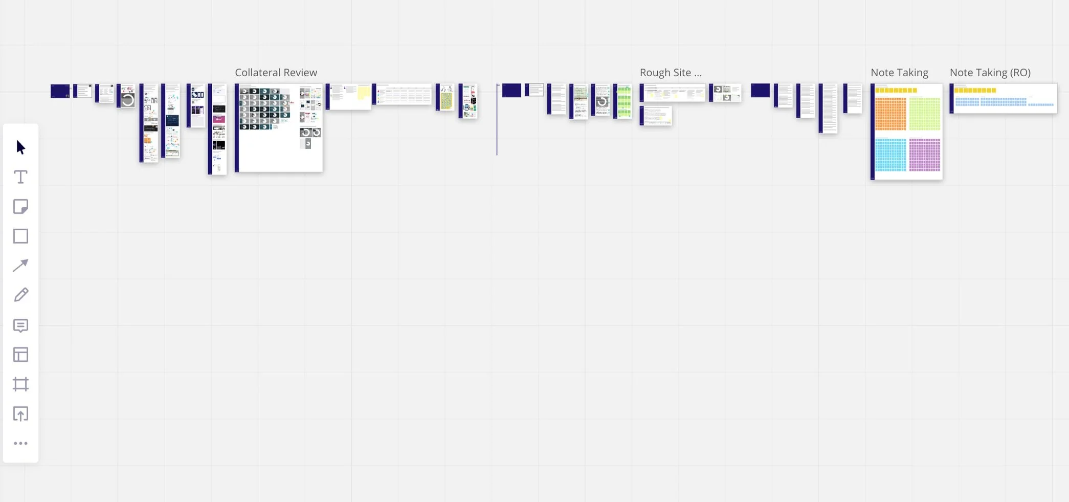
Project space created from initial brief to testing

Current service review and exploration of space.

Archetype/ Persona creation before Journey Mapping
Phase 2: Definition
Creating designs to test
Once I had explored the current system, app store reviews, social media forums of active users for benchmarking the current user experience and highlighting problems within for us to solve. I then began to sketch what could be in the new design to discuss with the project team, from which the high res designs were created.

Some more rough sketches to communicate my idea of the onboarding preference set-up widget


Creating the Visual Communication Design
We wanted it to be simple and helpful, to guide and not overwhelm our service users. It needed to be easy to understand for all people so we used visual cues such as icons and imagery. We always had the option to make an emergency services call on screen at all times.

On first launch the user gets the option to customise.

Helping the user decide between services based on their own needs

Different status bars to show the user if the call is still connected, a big pain point we solved from the existing design
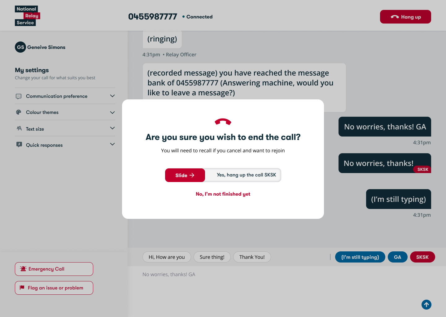
A trial design we tested, which had a different acton to end the call, to be sure not accidentally pressed
Stage 3: Testing
Testing Sessions
The sessions ran for 90 mins and began with a few minutes of content setting, a context gathering interview for 25 mins, testing of the clickable prototype for 40 mins and then 20 mins of feedback capturing to close. This allowed us to first understand the problems with the real people who experience them, to put forward our solution to then gather honest feedback.
User Testing sessions in progress. Left: My testing script.
Right: Top bar of zoom call. Left: Myself. Middle: The Interpreter translating our questions. Main: Our Deaf user tester.

Some of the user feedback we received. “Existing service: 1 or 2 / 5 It’s so bad…” “New Designs: 5/5 I love it…”

User testing board before synthesis

User testing board before synthesis
Stage 4: Launch
The Research Pack
I created a detailed Presentation/ PDF, covering the projects process, learnings, outcomes and future scope. On two occasions I presented the deck, the first to a group of stakeholders on the clients side and the second to the internal design studio team.
Here’s a few highlights: (The whole pack is 98 pages long)


Designed at Concentrix Catalyst National Relay Service Site

