

Designed a easy to understand website for a superannuation original to help customers make sense of their financial options
Client:

MY ROLE:
Senior Product (UX/UI) Designer
WORKING WITH:
Account Manager, Developers & Client Stakeholders.
SECTOR:
Finance / Super
Date:
Jan ‘20

The Process:
Discovery Stage
THE BRIEF
As Australia’s first industry super fund, LUCRF Super is no stranger to leading the way. When it partnered with us to rebuild its website, the vision was more than just a new site. True to its philosophy of always putting members first, it wanted to completely redefine the industry benchmark for online user experience.
framing the challenge
How can we create a friendly and helpful experience for members and employers? How can we make life easy for those who are busy and those who have EASL?
The key objectives were also fairly straightforward: to drive membership growth and retention through an improved digital experience.
“The project was driven by a genuine desire to understand the unique needs of our particular members and support them in a way that differentiates us from other super funds.”
KICK OFF
Getting up to speed with the UX Review
I joined the project after a 3-month discovery engagement encompassing competitor analysis, comparator reviews, heuristics analysis, immersion workshops, stakeholder interviews, user testing, and external research with members and employers had just been completed.

The Experience Map was the main output of a through UX enagaement.
RESEARCH
Using the experience map as a base
The Experience map was a beautiful resource that showed 4 main user’s journey with super and other services over their lifetimes. It showed the member’s pain points and thoughts along a timeline.

The Experience map with my ideas on post-its surrounding.
I sat at the wall for a day immersing myself in the research and capturing any ideas for the new site. We then validated as a team and presented back to the stakeholders.
RESEARCH
Translating post-its to ideas we presented
For each of the 15 insights the UXers identified on the map, we proposed several ideas for components, pages or content we could create for the new website. Every decision had to reflect the insights from the UX stage.

A slide showing how the insight ‘I need to sort my life out’ led to the creation of Life Moments content and the ‘Speak to a Business Development Manager’ callout block.
“We stayed true to the findings of our research and everything we built relates back to a customer need or solves one of their pain points. We took every possible opportunity to say ‘How can we refine this now, so you don’t have to come back to it down the track?’ We ended up with a very advanced website for an initial launch.”
RESEARCH
Using Behavioural Insights to inspire the design
We profiled 6 or so key behavioural insights and covered how these learnings can be incorporated into the designs. Here we show the ‘Transparency effect’ and ‘Reactance’.


RESEARCH
Similar worlds and Competitor Review
We checked in with how other Super organisations or similar services are implementing the sector standard.

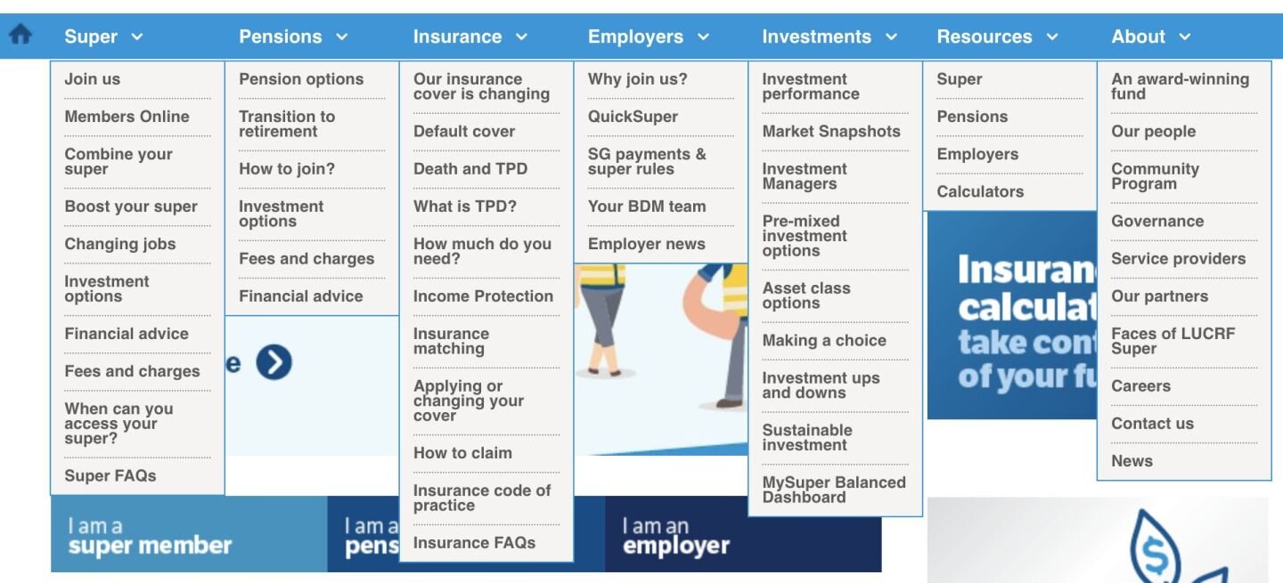
information architecture
Making the menu structure easy to navigate
We broke the menu structure into a main and secondary structure to visually differentiate between the key pages identified in the research stage.

Version 6 of the site map.
We identified over 30 Life Stages that members go through and that custom information applies for each. We displayed them in a way that was devoid of linear order, to not appear like a prescribed timeline of key life stages.

Life Moments Listing Page

An early design of a Life Moment article page. We included estimated read times.
Definition Stage
WIREFRAMING
Creating wireframes
We began with the menu and the hierarchy and using a mega menu design.

Mega Menu Wireframes.

The live site Mega Menu.
The old site’s confusing top menu structure.
TESTING
User Validation
We only got to test adhoc with a limited base, but as such an expansive research phase had been carried out and documented we could check back in with key users.
PROTOTYPES
Design Direction
LUCRF had an existing brand guidelines but they were more aligned to print usage. We were encouraged to ‘run with’ the design style.

Early Moodboard.

Early Moodboard annotated.
We used imagery of actual members so people would feel welcome know it’s a place for them.

The live final site, Home page.
We mapped the visual direction and imagery rules. We made sure the colour combinations passed WCAG guidelines.


Deliver Stage
PAGE design
Finalising Visual Designs
We planned the content flow and working with a client side copy writer began to rework or create content as needed. We didn’t just want it to be a ‘lift and shift’ from the old site to the new.
![The Investments overview page. The old design [left] and our new design [right]](https://images.squarespace-cdn.com/content/v1/5b6119e5cef372b5718cf42e/1629681990301-39FLTR4F3KE77T76OSPB/lucrf+4.png)
The Investments overview page. The old design [left] and our new design [right]
We ran the project fully agile and conducted 14 two week sprints, including design and development.
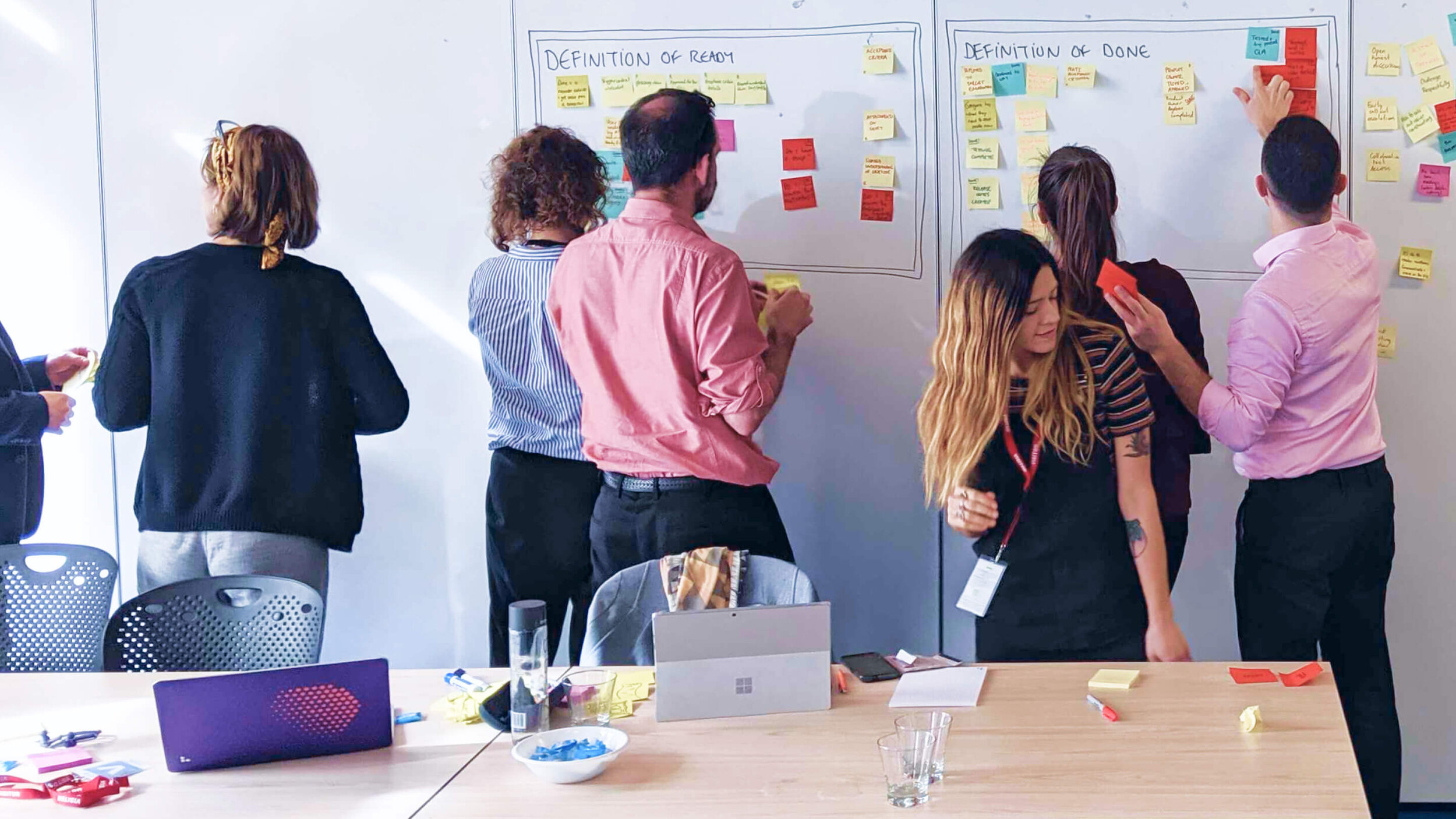
Our team in the kick off workshop mapping our collective ways of working.
Image courtesy of Luminary Studio.
DESIGN TO DEVELOPMENT
Handover to the Development team
We built the components based on an existing basic structure design system. We then themed to the styling and tested. We also created completely new components

the result
From a user experience perspective, one of the hallmarks of the LUCRF Super website is its elegant simplicity. But it is the level of complexity and attention to detail under the hood that have made such frictionless UX possible
The final build incorporated more than 80 functional components, with just about every possible micro-interaction considered and accounted for. The project’s agile methodology was particularly conducive to ongoing feature iterations throughout the build.
“One of the best things about this project was how much we learned from each other, and how well we adapted to each other’s approach. It was a genuine collaboration. We both had a commitment to evolving how we worked as the project progressed. It was a real coming together of two unique organisations to get the best outcome for our members and employers.”
final word
Conclusion
It was a pleasure to work with the project managers and development teams at Luminary and try to do justice to the amazing research phase captured by the UX team. We worked hard to have a considered, bite-sized flow of information to the members at an easy to process pace. We didn’t want anyone to feel like they need a degree in Finance to understand and be able to feel empowered to take control of their financial future.
“Just passing on my and the teams thanks and appreciation for having Nicole work on our project. We are all huge fans of her design work and the thought process gone into all her designs. She was quick to understand our needs and thinking and showed patience whilst we were learning to find our feet. Nicole has set up the foundations of a great looking and very user experienced focused LUCRF Super website. Nic was a wonderful asset to the project.”
Designed at Luminary Studio
In partnership with Our Very Own Studio
View live site LUCRF Super
Award Details DrivenxDesign

The Life Moments Article on the live site