Designed updates to the app for Lifeblood/ Red Cross to help drive more donations through celebrating donors past engagement & commitment
Client:

MY ROLE:
Senior Product (UX/UI) Designer
WORKING WITH:
UX Designer, Stakeholders & Product Owners
SECTOR:
NFP / Health
Date:
Jul ‘21

Image courtesy of Bound Studio
How might we drive more blood, plasma, platelets, breast milk and other vital, life saving fluids donations? How can we celebrate past donors contributions and welcome new donors?
THE BRIEF
Every time someone donates blood, three human lives are saved. Our goal is to make the process of donating blood and other matter easier and more convenient and encourage those whose have gave before, to give again.

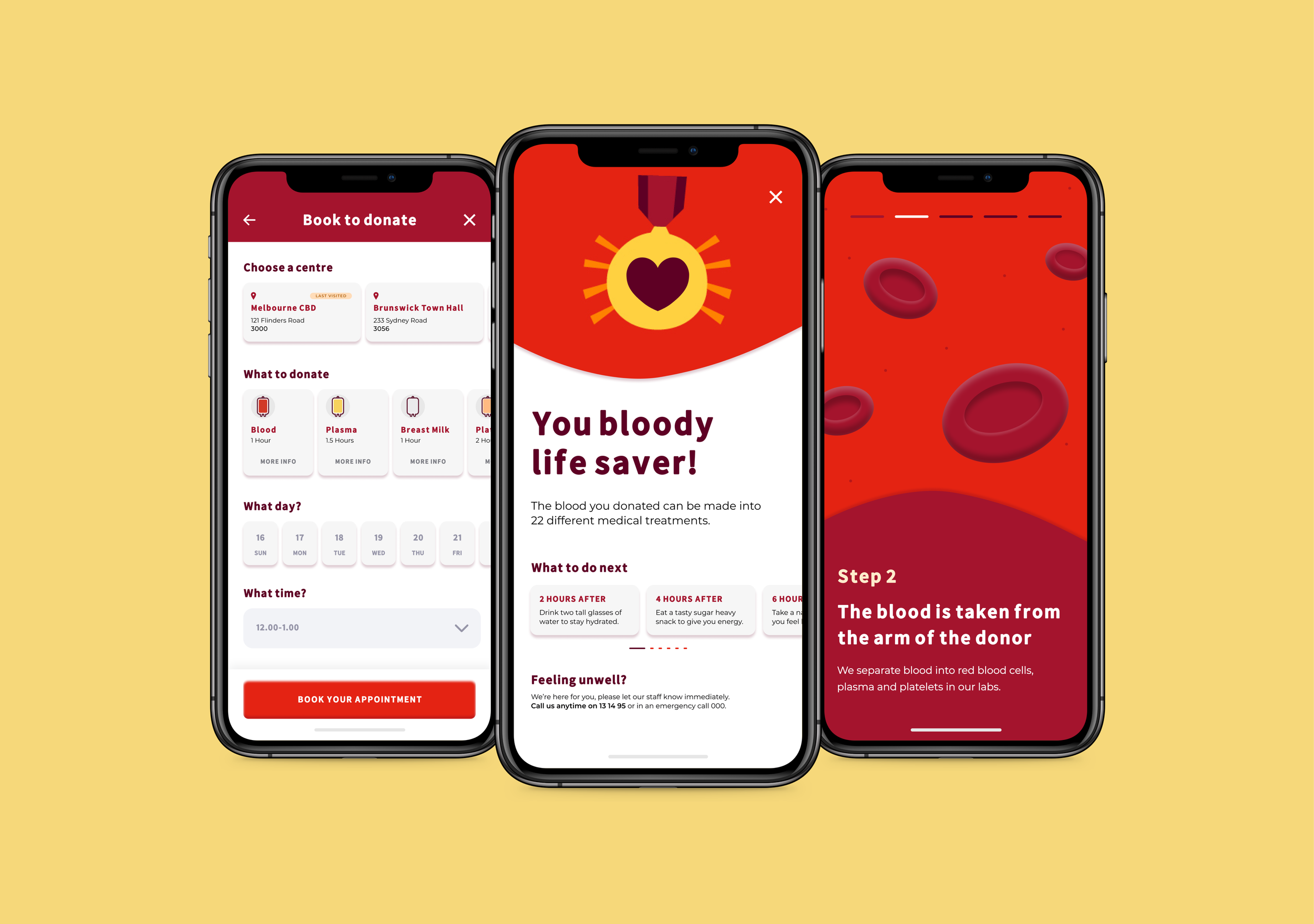
Left: Yearly Recap of donations screen Middle: After Donation screen Right: Educational Game screen
Our approach was to make it fun and engaging whilst simultaneously reminding and thanking the person donating for their kind impact and how that benefits their community.
Yearly recap screen that celebrates the donors contributions.
Stage 1: Discover
Project Kick-Off
We began by unpacking the flow for user re-engagement and creating personas to discover who the users are to best plan a strategy for engaging return donors.


Stage 2: Designs
Framing the Solution Flow
The early solution planning was turned into a storyboard flow, to show each possible feature through a human led narrative.


A work in progress of the final story board deck created.
Stage 3: Visual Designs
Basic Wireframes
To quickly show our ideas and get feedback before investing time in Visual design, we created rough prototypes that were annotated to further convey the ideas.

Early wireframe of the home screen

Wireframes in Miro with team and client feedback for each screen
Visualising our Ideas into Designs
For each re-engagement step called out in our Storyboard, I created a screen to showcase the feature in action and show how it would look like in the app.

Donation History stats to celebrate past commitment

The game was created to walk first time donors (or not those who have not donated in a while) through the process.
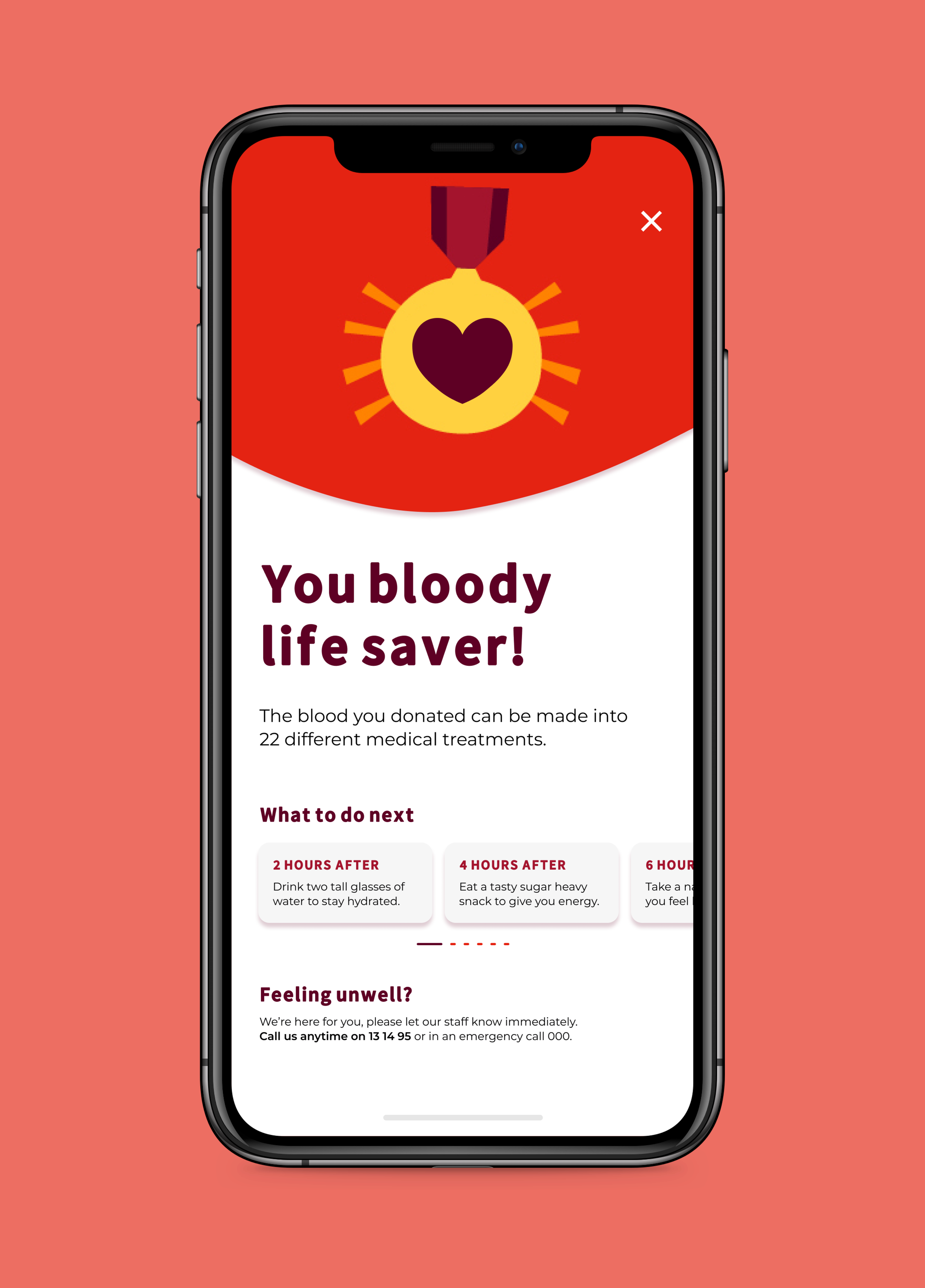
The after donation screen that gives support to the donor.

The improved booking form that remembers where your last session were to help the donor book faster.

Design options for donation review content block

Card designs housing various content

Booking confirmation screen, giving a human touch on the process.

Alternative design of the home screen

Still from final Storyboard presentation we created

Designed at Bound Studios (Formerly Our Very Own)