

Designed a digital experience for a charity to help children & families access information, support, education & donate
Client:

MY ROLE:
Senior UX/UI Designer & Illustrator
WORKING WITH:
Developers, Lead UX Designer, Account Manager & Client Stakeholders.
SECTOR:
Not For Profit / Early Learning
Date:
May ‘21

The Process:
Discovery Stage
THE BRIEF
We were tasked with redesigning the Kids First website, streamlining the user experience through a refreshed interface, redesigned information architecture, and the development of a visual design that purposely left out sad, grey imagery in favour of fun and bright illustrations to appeal to users whose lives may be anything but.
framing the challenge
How can we make the site welcoming for both a parent looking for a school to send their child and someone in urgent need of a support service?
RESEARCH
Co-Creation Workshop
Informed by a comprehensive customer and stakeholder research period, it was essential that the rebuilt site would make accessing Kids First’s programs quick and easy.

Key Screen Sketches with client stakeholders.

My rough sketches for the home, emergency help, donation and other key pages.
RESEARCH
Creating User Personas
After finding out as much as we could from the client as to who the real people who benefit from their services are, we then distilled this knowledge into generalised personas.

RESEARCH
Aligning to the sector standards
To see what’s best practise in the sector, we spoke through the web experiences of the peer organisations in the NFP Industry. We conducted a round of voting, then discussing elements, features or information we were inspired by.

information architecture
Crafting a logical IA
With the different service areas that the NFP covered, both Education and Support Services, we needed a clear menu structure that could help our varying users very easily work out what they do and then where they could find the information they’d need.
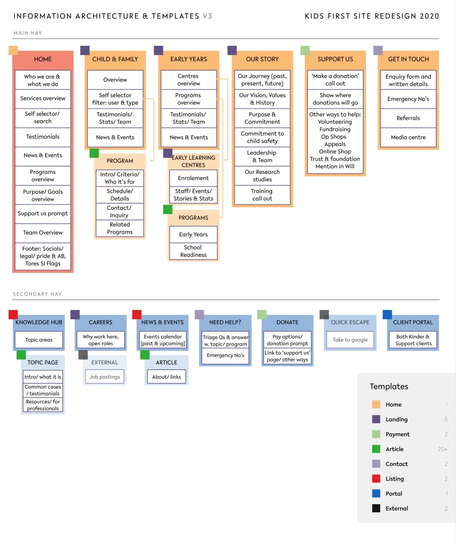
This IA covers both the parent and child structure but also templates and what content will go on those pages.
CONTENT REVIEW
Considering user types and content categories
When planning what users to recruit and the personas, we began to see an opportunity to consider working these into the site through content categories and the filtering system.
Thinking about this early meant we could test, but also create content to match this system.
A person could self identify and filter through to more relevant content.

Us planning content tags for the site’s filter system.

The final filter system on the live site.

The ‘Self Selector’ filter on the home page.
We branded the ‘Early Years Education’ and ‘Child & Family Services’ sections, by creating a custom icon and colour scheme for each

The icons needed to work at different sizes.

The Child & Family Services section in a Green scale palette.

The Early Years Education section in a Orange scale palette.
Definition Stage
WIREFRAMING
Creating wireframe designs to test
After we had agreed on the site map and what should go on each page, we began to wireframe the key pages, starting with each template type first.
![[Left] Navigation options for differing ways to show the Early Years and Family Services sections. [Right] Early Years Landing, Kinder Landing and Program Article.](https://images.squarespace-cdn.com/content/v1/5b6119e5cef372b5718cf42e/1629539248662-V49AJ7WB0AKHZY7OHJ5L/Screen+Shot+2021-08-21+at+7.36.01+pm.png)
[Left] Navigation options for differing ways to show the Early Years and Family Services sections.
[Right] Early Years Landing, Kinder Landing and Program Article.

user testing
Testing with real users
Kids First were kind enough to line up over 10 interviews with both internal and external people who have used the wide range of services.
We spoke to a few people who had Family Violence or other family based issues and used the counselling and group program options available, some who had found a kinder for their children, some who were industry experts or studying in the field looking for research studies and some who had been referred by court systems.
PROTOTYPES
Visual Designs
Testing with the real future users showed us how to tighten up our language and how much information we should show and when.
The overall feedback was positive and all users understood the different parts to the NFP’s services once seeing the homepage with branded nav and cards sitting just below the top header.

An old iteration of the home page.
PROTOTYPES
Finalisation of designs
We then bought the updated wireframes to life by adding Kids First’s visual style.
The client said they would like “nothing from the old site” and gave us “full creative control” to evolve the brand and create custom illustrations.

Article Page: From wire to design.

Custom Illustration set created for article headers and other placeholder purposes.

The Animals were made from the shape blocks in their existing icon set.
It is a tragic reality that many people seeking assistance from Kids First are doing so in a potentially unsafe environment, be it due to domestic violence, addiction, housing insecurity or another position of duress.

I got inspired by Penguin and Pellican classic book covers, as they portray serious themes in a respectful way.
To help protect those looking for urgent help, or those researching these support services at work, at shared computers or in other highly visible locations, the primary navigation features a clearly marked ‘Quick exit to Google’ link, as well as the option to hide sensitive or triggering page titles.

On Desktop, the majority of the content sits in the middle of the page to avoid being seen over the shoulder and we have a ‘Hide Title’ functionality to hide any potentially triggering titles.
“The regular phrasing was ‘Quick Escape’ but it gave no clear idea of where you’d end up and almost sounded like you were booking a holiday. So we renamed the label to ‘Quick Exit to google’ to make it really clear.”
The majority of the site’s content sits in the centre of the screen to avoid being seen over the shoulder by others, and a ‘Need urgent help’ call-to-action quickly provides links and phone numbers for child protection services, suicide helplines and LGBTIAQ+ support.

We worked in conjunction with Kids First’s qualified counsellors to ensure those seeking help would find the site’s interface, design and language comforting and easy to navigate.
We created a resource section, called the ‘Information Hub’ to make it easy for helpful information to be accessed by practitioners or those seeking help.

Deliver Stage
ADDITIONAL PAGES
Creating new reusable components
We first looked at the content to work out the best ways to showcase. Then we made sure the next pages we made were headed by the templates already created and just designed the new components that were needed.
![Landing pages with shared and new components [left] Kinder Centre and [right] Who We Are.](https://images.squarespace-cdn.com/content/v1/5b6119e5cef372b5718cf42e/1629599380619-CQZSUP6W81Z33I41SL93/Screen+Shot+2021-08-22+at+12.29.08+pm.png)
Landing pages with shared and new components [left] Kinder Centre and [right] Who We Are.
![Desktop [above] Normal and Sticky and Mobile [below] Collapsed and Expanded.](https://images.squarespace-cdn.com/content/v1/5b6119e5cef372b5718cf42e/1629543708769-O3KA2WTV15WHI0Q917U7/Screen+Shot+2021-08-21+at+9.01.31+pm.png)
Desktop [above] Normal and Sticky and Mobile [below] Collapsed and Expanded.
We bought the illustrations to life by creating custom gifs and using Lotti software to embed in the site

Create in Adobe Animate.

Final Design
HANDOVER
Creating a shopping list of elements
We made a catalogue of all the components we created to make it easy for our team of developers to build them and place in Story Book, so we could QA each component early on in the process.
This also allowed the client to have a set list of components for when they would build new pages, which future proofed the designs and made it easier for content creators.

Here we see some of the card components we created.
DESIGN TO DEVELOPMENT
Handover to the Development team
We were developing in house so got the developers involved half way through the design stage to talk through how to tackle some of the complex integrations needed.
We were designing in Figma and had a shared design system to cover the basic design tokens.

Design system basics.

Notes for the developers on how to overlay the icons on the images and the naming conventions for the back end.
DESIGN TO DEVELOPMENT
Quality Assurance Testing
We ran several QA rounds to insure the final product reflected what was proposed in the design stage. A process that worked well for us were annotated screen shots, so it was clear and in context.

Annotated feedback for our Developers.
overview
Experts in the family violence, counselling and early education spaces, reinterpreting Kids First’s web presence to better support their services was a challenging but highly rewarding experience for everybody involved in the project.
Creating a streamlined but intuitive interface was fundamental in our approach to completing this complete redesign of Kids First’s public-facing web presence, enabling the not-for-profit organisation to continue providing their outreach to vulnerable people.
“Creating a new website is an exciting yet intense project, no matter the circumstances. This one was delivered entirely remotely, and through a pandemic! We were stoked to be in the safe and creative hands of Nicole, Neil, Shelley and the OVO team. It was a great design process and we now have a site that is functional, aligned to the needs of our community, authentic and engaging. We trusted OVO with our brand and they’ve not only stayed true to it, but evolved it further.”
Bounce Rate
7.26%
New Website
53.61%
Old Website
Exit Rate
25.74%
New Website
37.22%
Old Website
REVIEW
Limitations and dependencies
We were integrating with a Careers, Contact Form and Donation external platforms through plugins so lost some control over page and components styling, which was also not the ideal user experience. We worked around these issues the best we could and we reached out directly to their support teams to suggest updates.
final word
Conclusion
This was an amazing project to be a part of and to help showcase the great work that Kids First do for communities. I’m very grateful to have been able to design for such an important service and thank Clare and Alex and the rest of the team at Kids First for their support through out the project.
![The old site [left] home page and our new [right]](https://images.squarespace-cdn.com/content/v1/5b6119e5cef372b5718cf42e/1629547709098-SGD8R55PW95TTRXUA1ZB/Frame+41.png)
The old site [left] home page and our new [right]

