

Designed a product website for a major online payment service to help increase user engagement and conversion.
Client:

MY ROLE:
Senior Designer
WORKING WITH:
Branding Team, Product Owners, Developers, Account Managers and Stakeholders.
SECTOR:
Financial Services, Internet Banking.
datE:
Nov ‘19
The Process:
Discovery Stage
THE BRIEF
The existing site had poor client conversions, outdated design, and for a complicated service, had an unclear explanation, that left users isolated and confused.
framing the challenge
How can we make the convoluted process of selecting and installing a payment gateway as easy as possible?
RESEARCH- users
1. Persona: Main User
Business Owner who sells products or services online, and needs someone to facilitate the transactions by being the ‘middle man’ between the bank and customers.
Tech Level: Very basic understanding of e-commerce process.
2. Persona: Secondary User
Developers (or coders/ tech experts) who build online stores for businesses, both large and small.
Tech Level: High. But still need supporting documentation to still be easily explained.
RESEARCH- competition
Keeping an eye on our competitors
To see what’s best practise, and what we should do differently, we launched a study into what our competition are doing. We looked at companies that were both similar in services and that are in the financial industry.

information architecture
Dynamic site map that changed with the project
We started by seeing what worked from the existing site, and then what was missing. The site map evolved 5-6 times, from various findings, users feedback and internal stakeholder input. We had a place in the header navigation for developers to find related content to them, but nowhere relating to our main user group. So Business Owners was added, and bespoke content relating to business size created.

user testing
Measuring the existing offering
We conducted a round of user testing, with both Business Owners and Developers to bench mark the existing site and work out where it needed improvement.

We found testimonials worked best when sprinkled into the content, rather than just being on their own dedicated page.

Definition Stage
Prototyping
Rapid Sketching
After we had agreed on the site map and what should go on each page, I began hand sketching a rough version of each, with a breakdown of content. For my own purpose, and to discuss ideas with the team, before going to a shareable prototype.

PROTOTYPES
Low Fidelity Wireframes
The next stage was to start merging all of our learnings into a prototype. We started basic, showcasing the most important elements and narrative of each page. Stakeholders and Project Managers were shown next for sign-off.

I went and met with the support team, to work out what issues our users need help with. The issues then were categorised and became a trouble shooting widget on the support page, which answers queries with FAQs and helpful articles from the knowledge centre.


Prototyping
High Fidelity Wireframes
Next we focused in detail on the content, and its importance to our users. Due to the complex nature of subject matter- especially the products and how we communicate them to our users- this second round was needed.

We went through many different versions of how we communicate the products and price to our users. Do we combine? How much detail do we show? How do users tell what one is for them?

user testing
User testing the prototypes
We engaged 5 Business Owners to come in and test our prototypes with us. This was one of the most crucial stages, as you can hypothesise about what your users will do, but until you see, it’s unknown.
We purposely chose users that we’re in the beginning stages of their businesses, as generally speaking, their comprehension on e-commerce is very low, and will need extra help in the process. So if this user group can understand what we’re communicating, then the majority of our other users (big corps and developers) will understand too.

visual overlay
Working with the brand’s look and feel
SecurePay is an Australia Post product, and needed to be inline with the rest of the product family. I was working directly with the Brand Team, as Australia Post had just been through a re-brand, and this was the first project to launch with the new branding, even before AP’s main site.

Deliver Stage
VISUAL OVERLAY
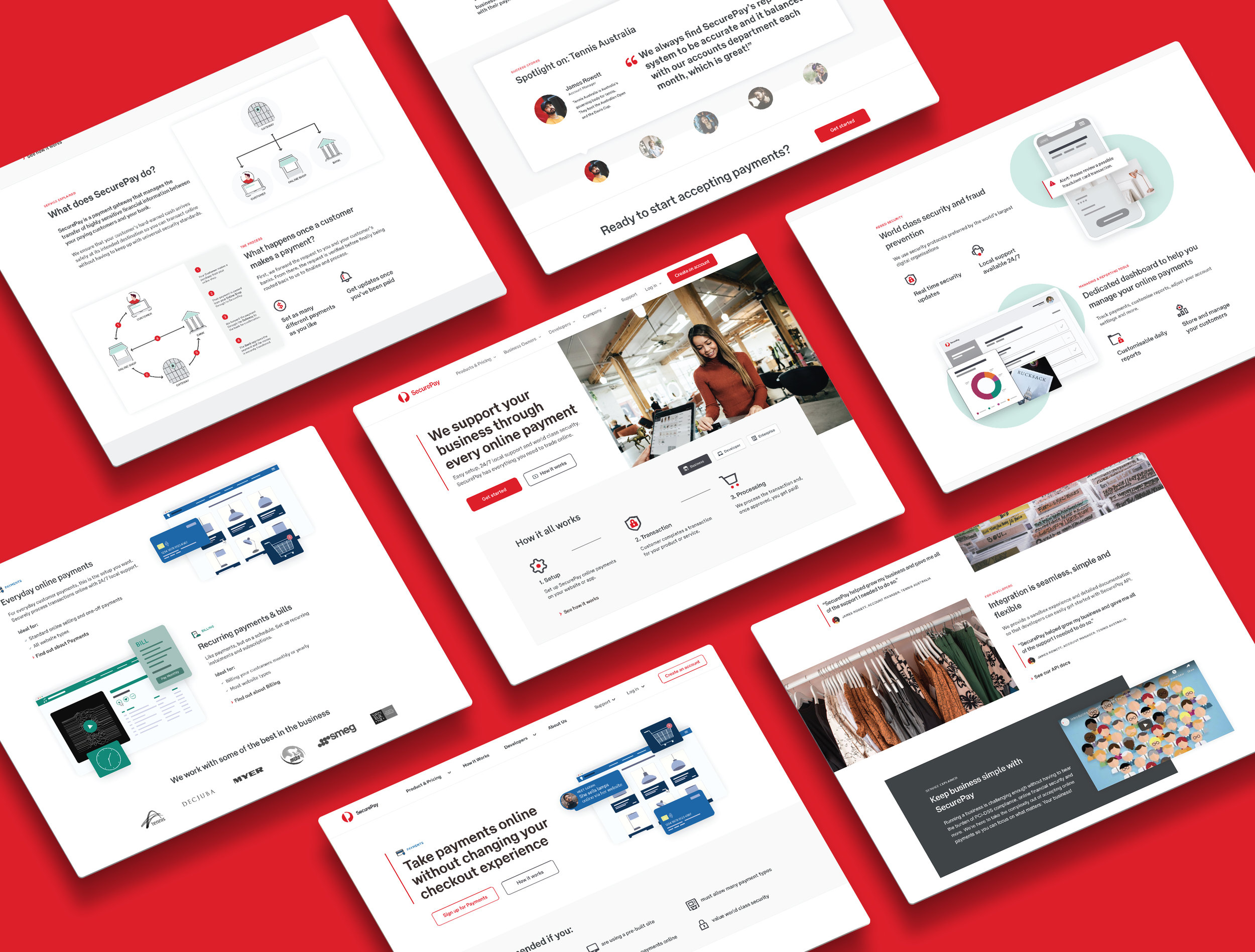
Infographics to communicate complex thinking
The whole process of a payment gateway leaves a lot of people confused, myself included. We knew that diagrams would help users understand, in a way that most can comprehend, removed from complicated language.

VISUAL COMMUNICATION
Finalising the UI Design
Once all of the elements were in place, I moved on to the UI design and started to build out elements, states and get ready to go to development.

DESIGN TO DEVELOPMENT
Handover to the Development team
Part of my process is to get the devs involved with the project from the beginning, to soundboard ideas with, as it makes the final design much better. I briefed the Devs on the designs, by walking them through each page in the design, and what each content block would do. We worked in an agile process, focusing on a usable product.

conclusion
What was learned
As in most cases, the most insightful moments were through conversations with our users. This project taught me how important language is.
Most business owners didn’t really know what a ‘Developer’ was, but understood, when labeled ‘Coder’ or ‘[your] Tech Help’.
Also, when labeled ‘Business Owners’, some of our users saw it as black and white, and asked where the content was for “people who didn’t own the business”, like account managers at large corps. Where as something more vague, like ‘Businesses’, would relate to all.
Very emotive, clever language selling the products, like “saves you time and hassle” was seen as “pushy” and “intentionally vague, like they have something to hide”. And wording like “everything you need to trade online” was met with “Surly they can’t do everything?! Are they going to help me take my photos to put online?”. You can’t be charming or clever. Only literally straight to the point, with small achievable promises.
It may seem somewhat cynical, but when it comes to complicated goals, yes- you should assure your users you can do it all, but also say what that will entail, in an open, honest and easy way, and you will rightfully gain their trust and time.
REFLECTION
Project Challenges
I was engaged for two months of my time, through a contract with the awesome Our Very Own design consultancy, to make a start on the site re-design.
The timeline was scoped on how much of my time the client’s budget could afford, not on how long it would take to complete the project. So, I had two months to design as much as possible.
Designed at Australia Post & Our Very Own
